Jacob Di Domenico
A program that helps customers save energy, earn rewards, and support a more reliable grid.
Redesign of the myEnergy Rewards landing page
To clearly communicate the program's value and encourage enrollment
June 2025 - September 2025
Designer, researcher, developer

Design Intent
Energy programs can feel complex. This redesign simplifies the experience so homeowners can understand the benefits and take action with confidence.
Industry trends
Energy programs help reduce costs and support the grid, but many homeowners are unsure how they work or how to get started.
Complex messaging and unclear value make it difficult for users to understand the benefits or feel confident enrolling.
Industry benchmarking
A quick review of competitors helped highlight industry patterns, uncover gaps, and identify opportunities for myEnergy Rewards to stand out.
Save on Energy
Save on Energy provides clear information about rebates and energy-saving programs, supported by strong government credibility. The site explains eligibility well and offers a wide range of programs for homeowners.
The experience can feel overwhelming due to dense content and heavy text. Key actions are not always immediately clear, and users may need to navigate multiple pages before understanding which programs apply to them.
The program clearly outlines available rebates and incentives, with strong visual hierarchy and recognizable branding. Information is structured around homeowner needs, making it easier to understand potential savings.
The experience can feel fragmented, with users often redirected across multiple pages and external tools. This can create friction and make it harder to quickly understand next steps or complete enrollment.
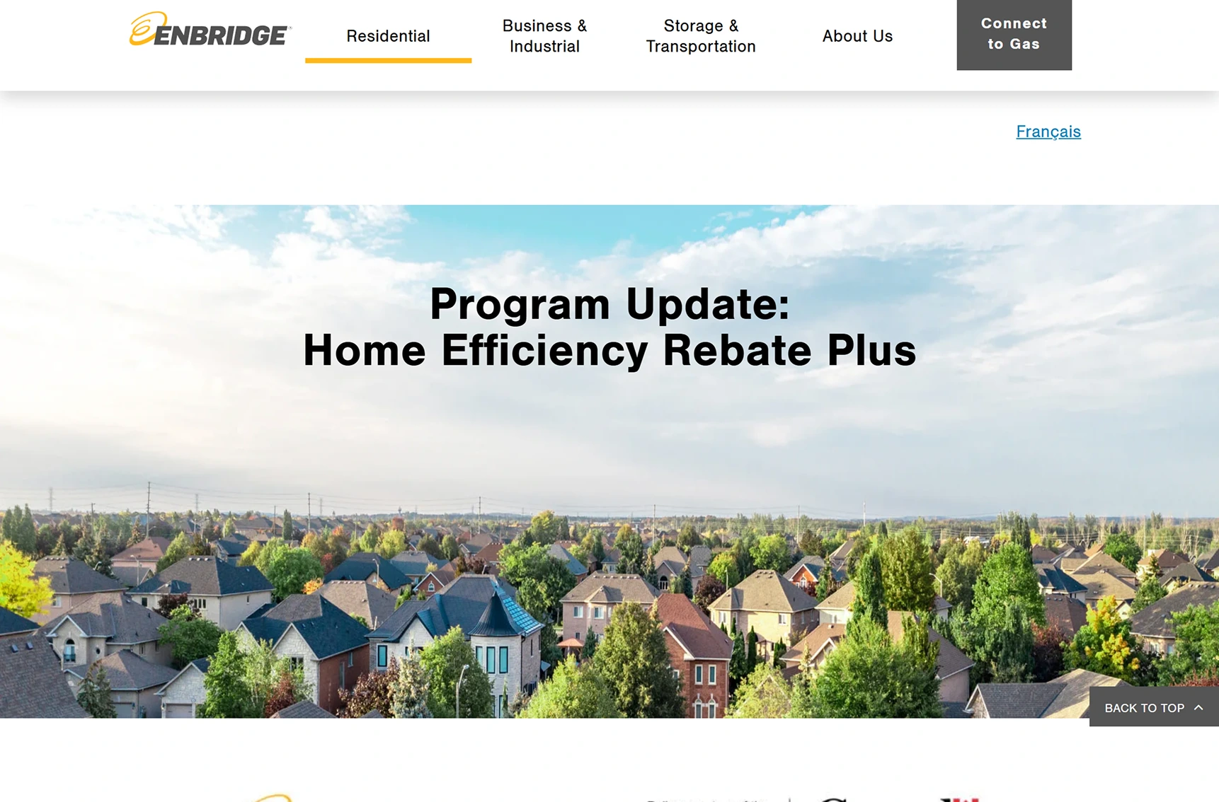
Enbridge Home Efficiency Rebate Plus
User feedback
A quick user survey helped highlight what worked, where confusion occurred, and how the redesign could better support homeowner decision-making.
(Rate 1-5, with 1 being very difficult and 5 being very easy)
(Participants answered Yes or No)
(Participants answered Yes or No)
(Participants answered very confident or not confident)
(Participants answered Yes or No)
(Participants answered Yes or No)
Insights from participants
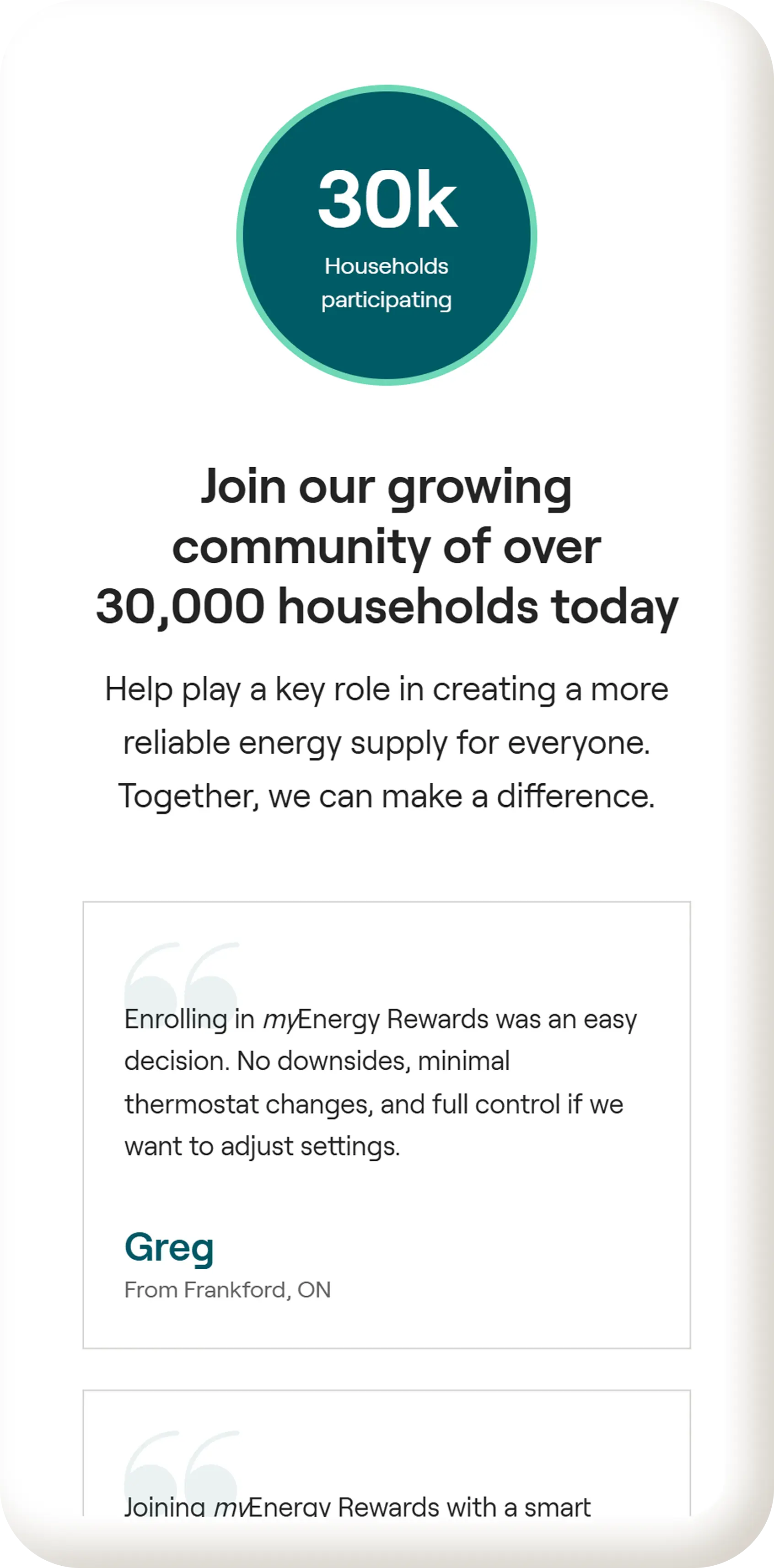
I wasn’t totally sure what I was getting out of this program. I could tell it was about saving energy, but the actual benefits and rewards weren’t very clear to me.
Survey participant
Anonymous homeowner
When I first landed on the page, I didn’t immediately understand what the myEnergy Rewards program was or how it worked. The headline didn’t clearly explain what the program does.
Survey participant
Anonymous homeowner
I found the enrollment options confusing. There were multiple ways to sign up for different devices, but I wasn’t sure which one applied to me or what my next step should be.
Survey participant
Anonymous homeowner
Insight-Driven Design
User surveys reveal insights you can't see on your own. Gathering feedback early helped validate assumptions, uncover blind spots, and ground the redesign in real user needs.
Our users
A research-driven persona helped clarify user goals, frustrations, and expectations, guiding the direction of the redesign.
Sarah Thompson
Energy conscious homeowner
To understand how the myEnergy Rewards program works in simple terms
To save money on energy without changing daily habits
To feel confident enrolling eligible devices
To support energy conservation without sacrificing comfort
Complex program descriptions that feel technical or unclear
Uncertainty about how enrollment affects daily energy use
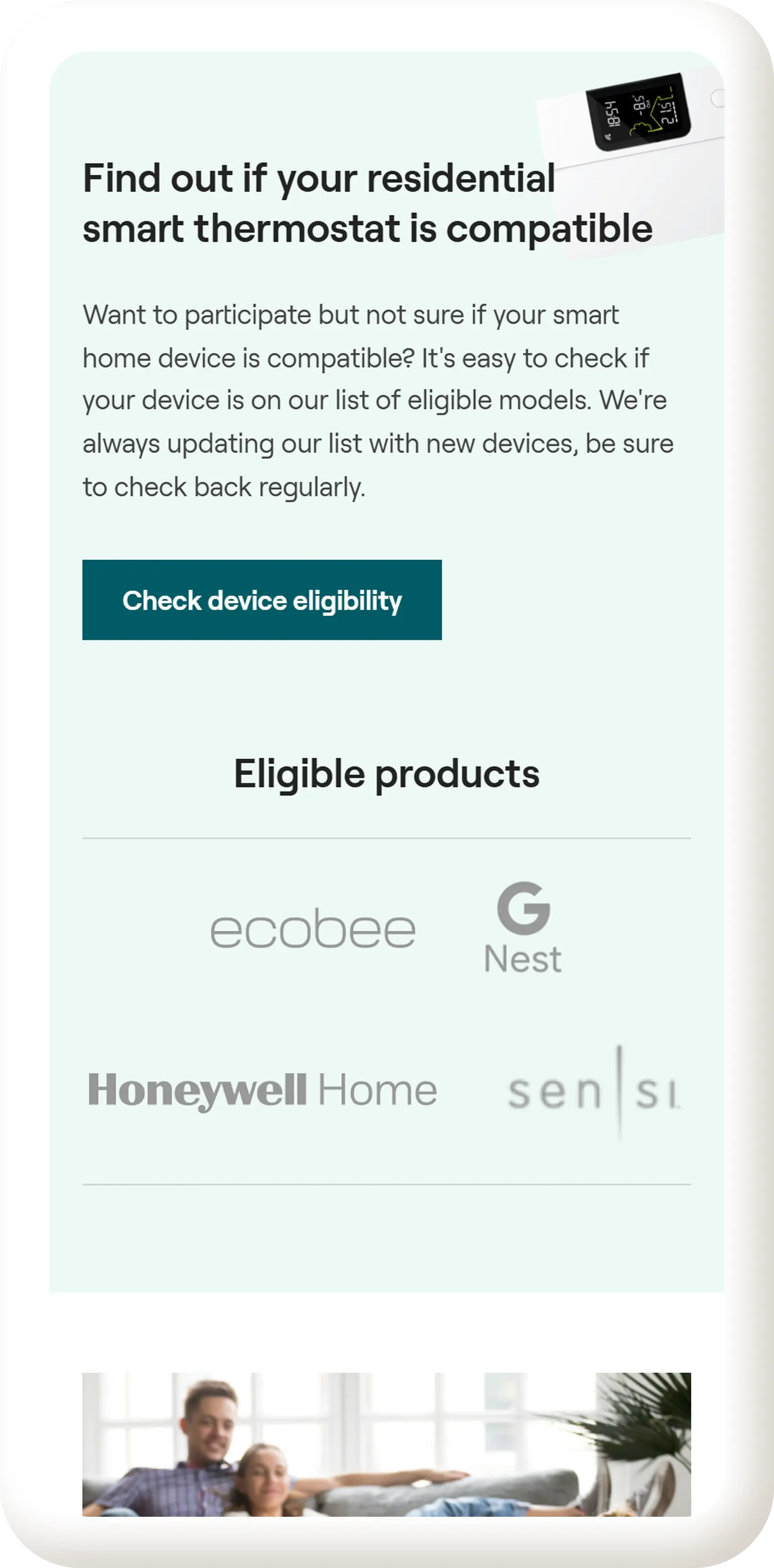
Difficulty understanding which devices are eligible
Feeling unsure about what happens after signing up
39
Project Manager
Mississauga, Ontario
Sarah is a homeowner living in Ontario with a busy household and a full-time job. She cares about reducing her energy costs and making environmentally responsible choices, but she doesn't have the time or patience to dig through complicated program details.
When visiting the myEnergy Rewards website, Sarah wants to quickly understand what the program is, how it benefits her, and whether she’s eligible. Clear explanations, reassurance, and a straightforward enrollment process help her feel confident taking the next step.
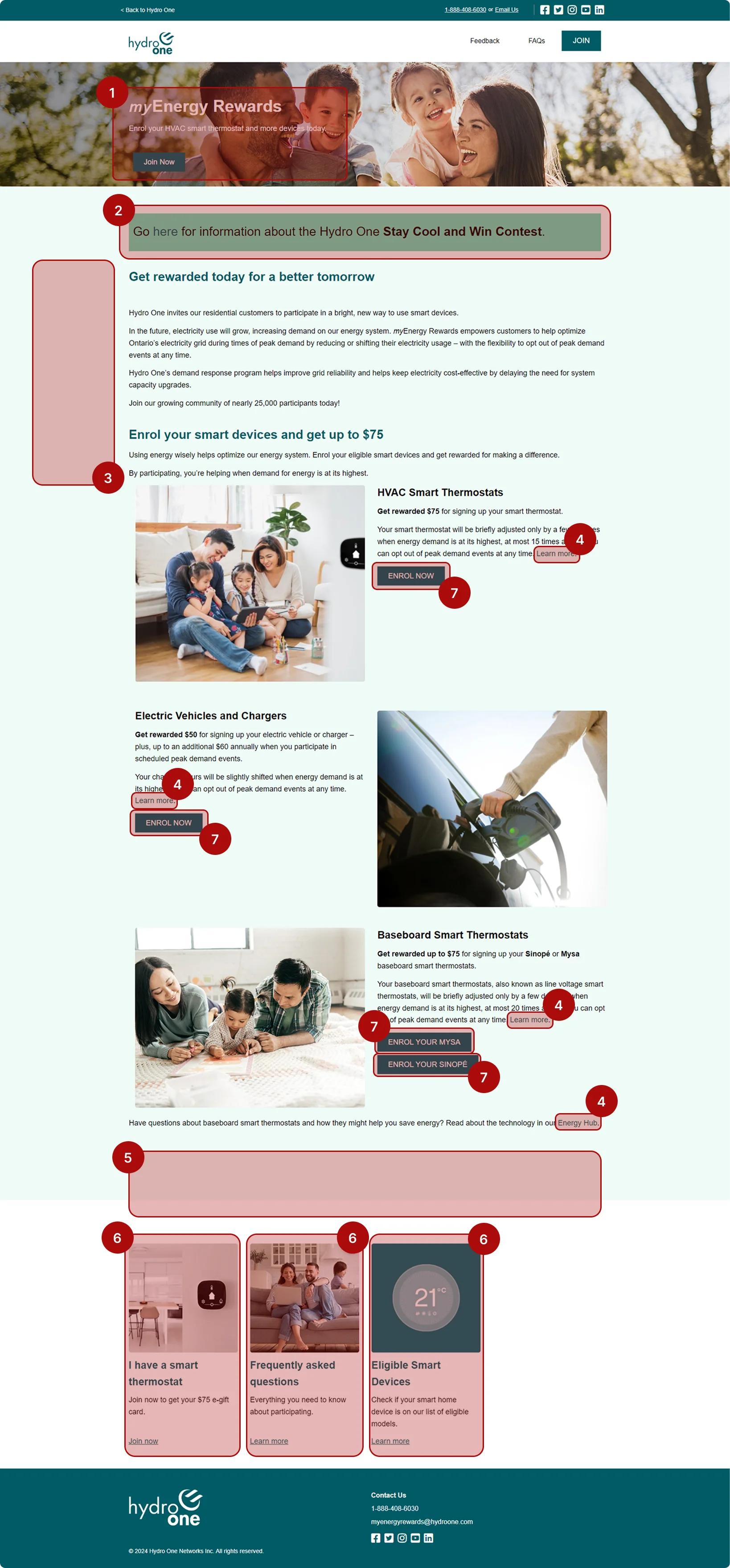
Expert review
Reviewing the old website through UX heuristics made it clear where users were struggling and where the design needed to be more intuitive.
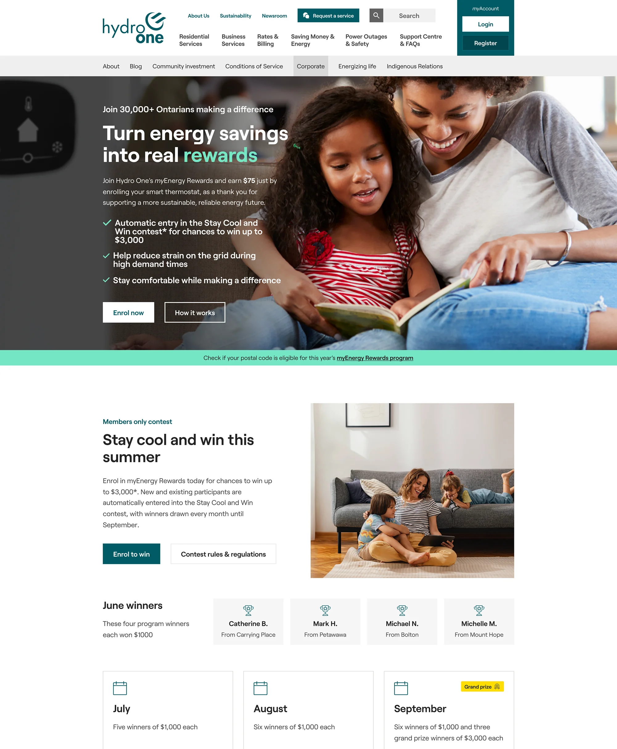
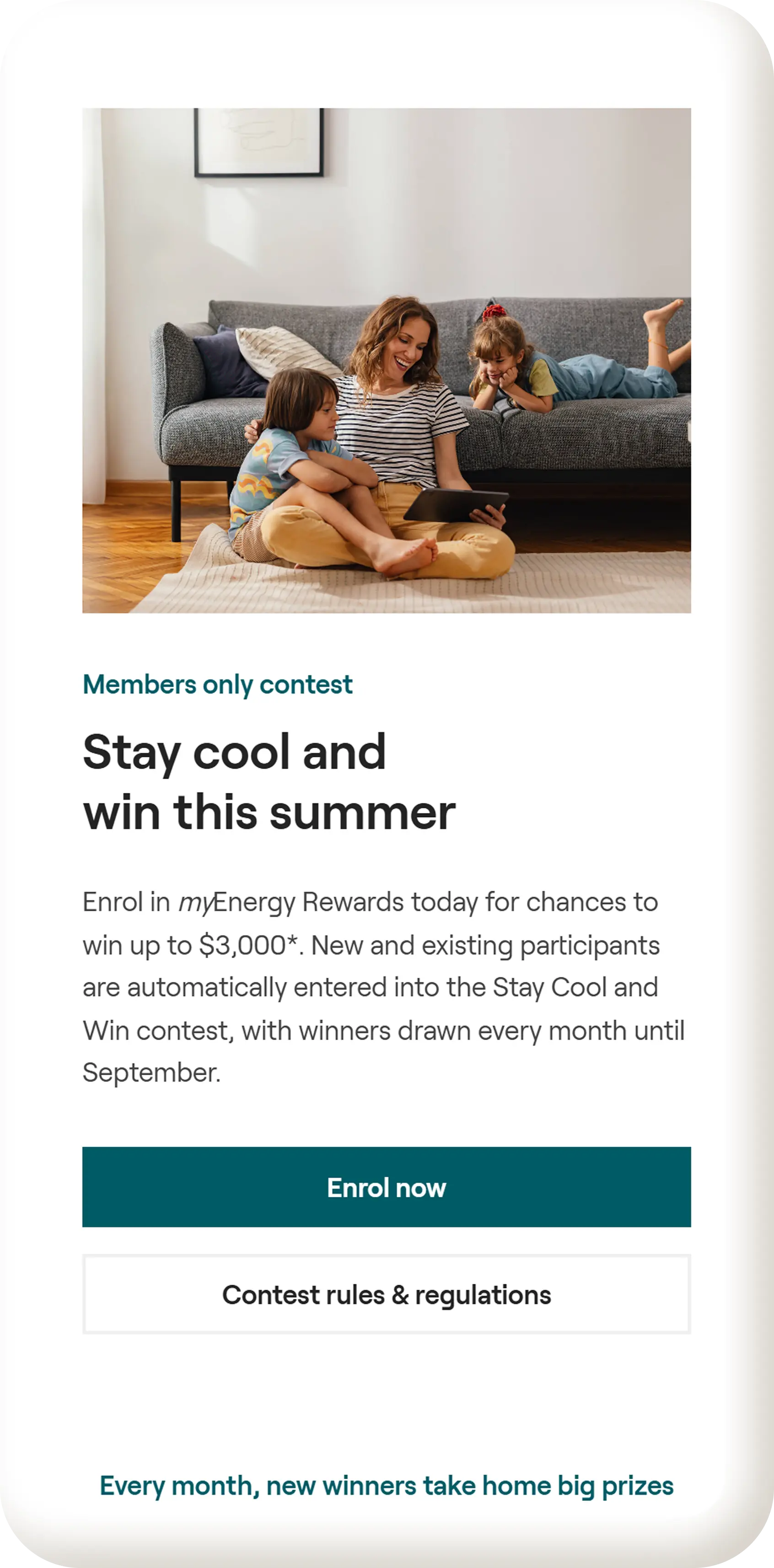
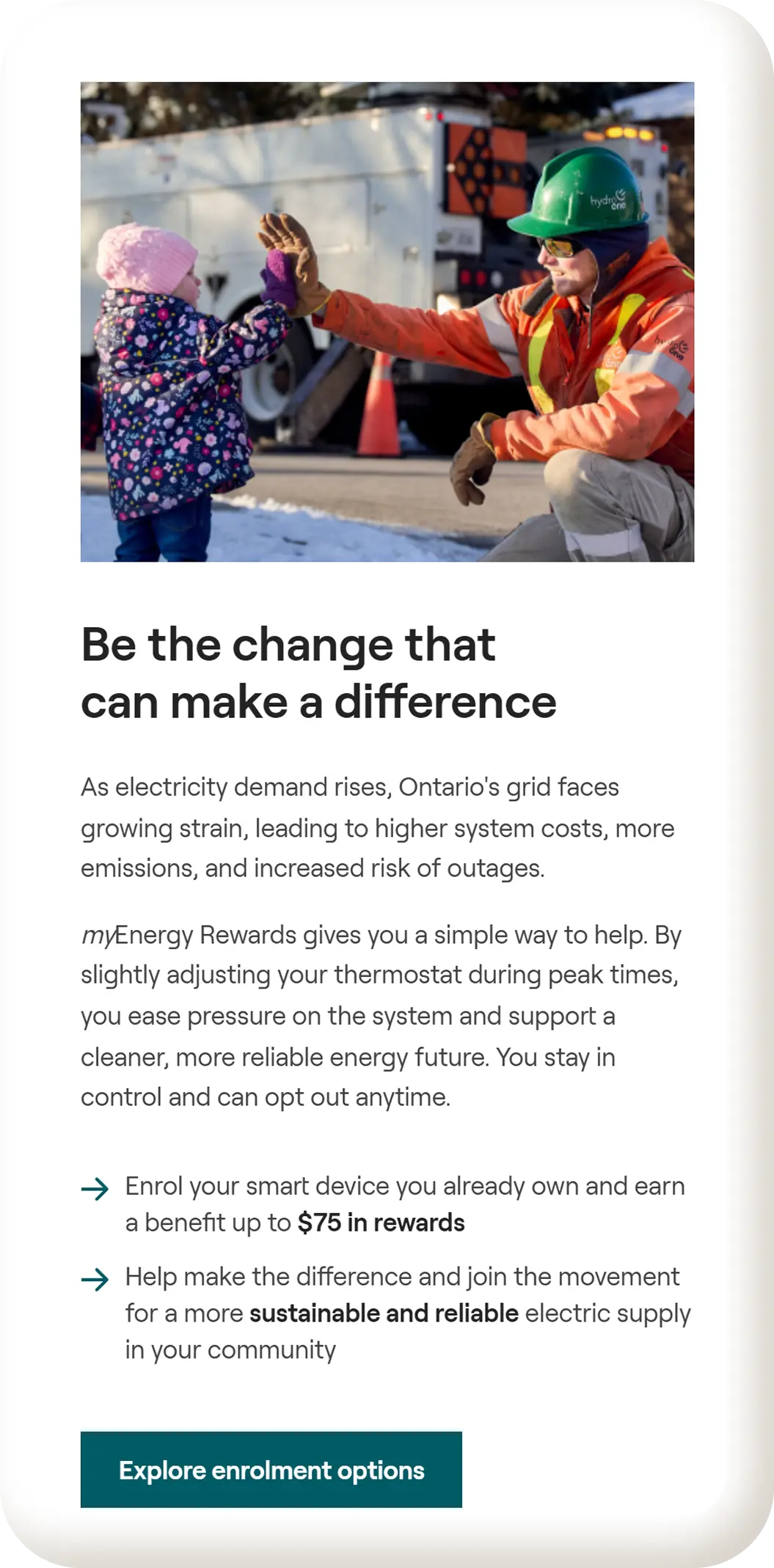
The headline does not clearly explain what the program is or why it matters within the first few seconds. A stronger H1 following a problem and solution framework, supported by a social-proof kicker, concise subcopy, and clear primary and secondary CTAs would help users quickly understand the program and take action.
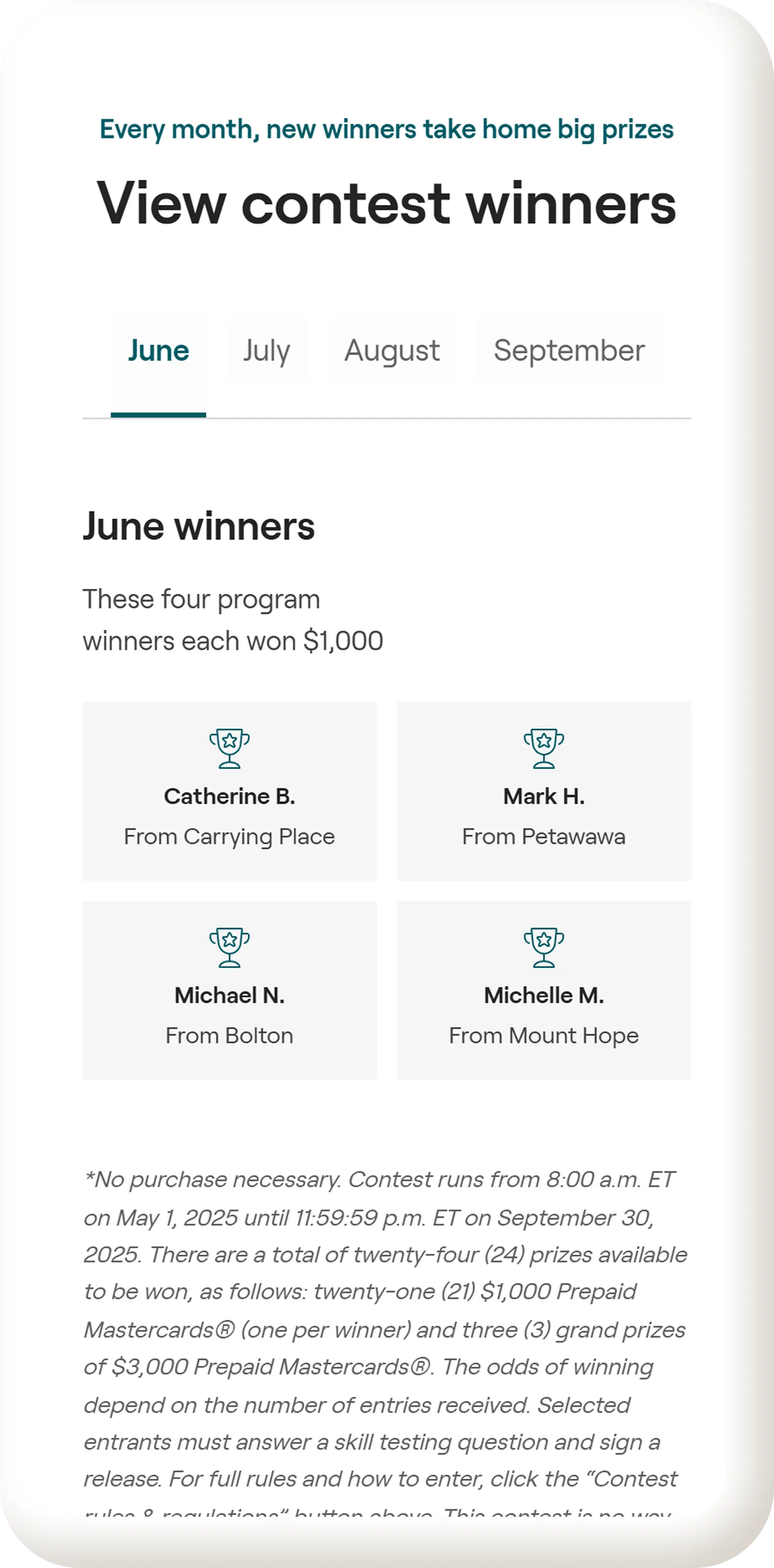
The Stay Cool and Win contest is presented as a single line of text with little context or visual emphasis. Without details about the contest, prizes, or relevance, users are unlikely to engage. A dedicated section explaining the contest would improve clarity and perceived value.
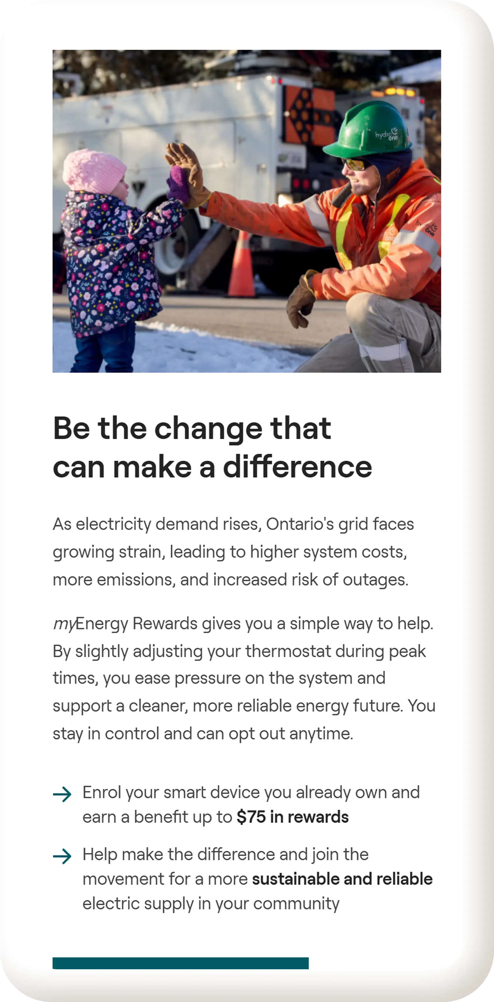
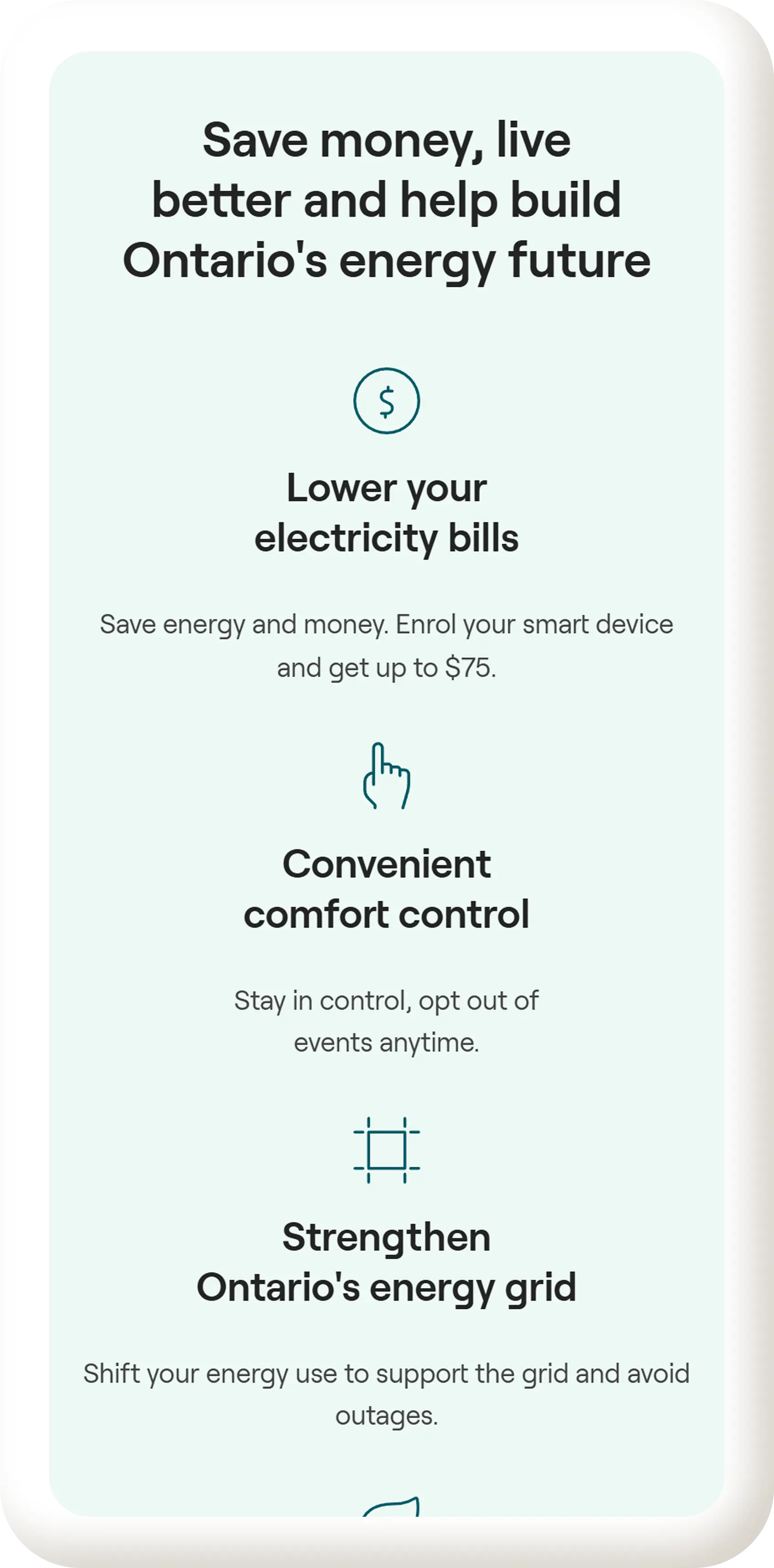
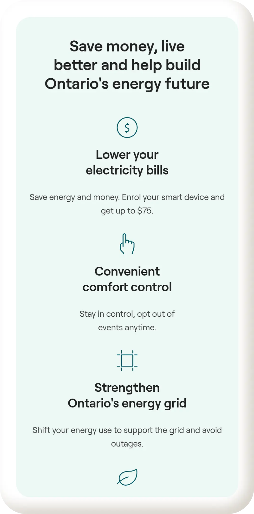
The landing page does not clearly communicate the benefits of the program. There is no dedicated section explaining what users gain by enrolling, making it harder for homeowners to understand why participation is worthwhile.
Text links throughout the page lack consistent visual treatment. Some links are difficult to distinguish from body copy, reducing scannability and clarity. Consistent styling such as underlining and weight would improve usability and recognition.
Content between the hero and footer does not systematically address user questions or concerns, making it harder for users to build confidence before enrolling.
Key information such as FAQs and eligible devices is hidden inside small cards rather than presented as full sections. Expanding this content into dedicated sections would improve clarity.
CTA buttons use inconsistent capitalization and language across the page. Maintaining sentence case and more intentional CTA copy would improve visual consistency and reduce cognitive friction.
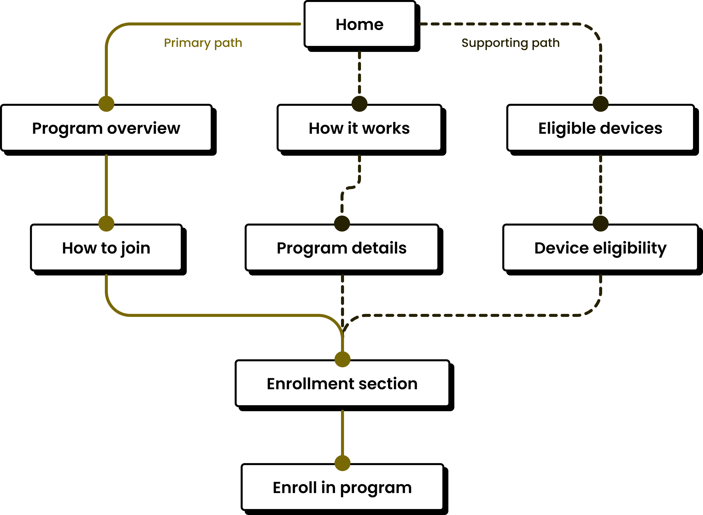
Understanding the Path
Mapping the user flow helped clarify how different sections support understanding, build confidence, and guide users toward enrollment.
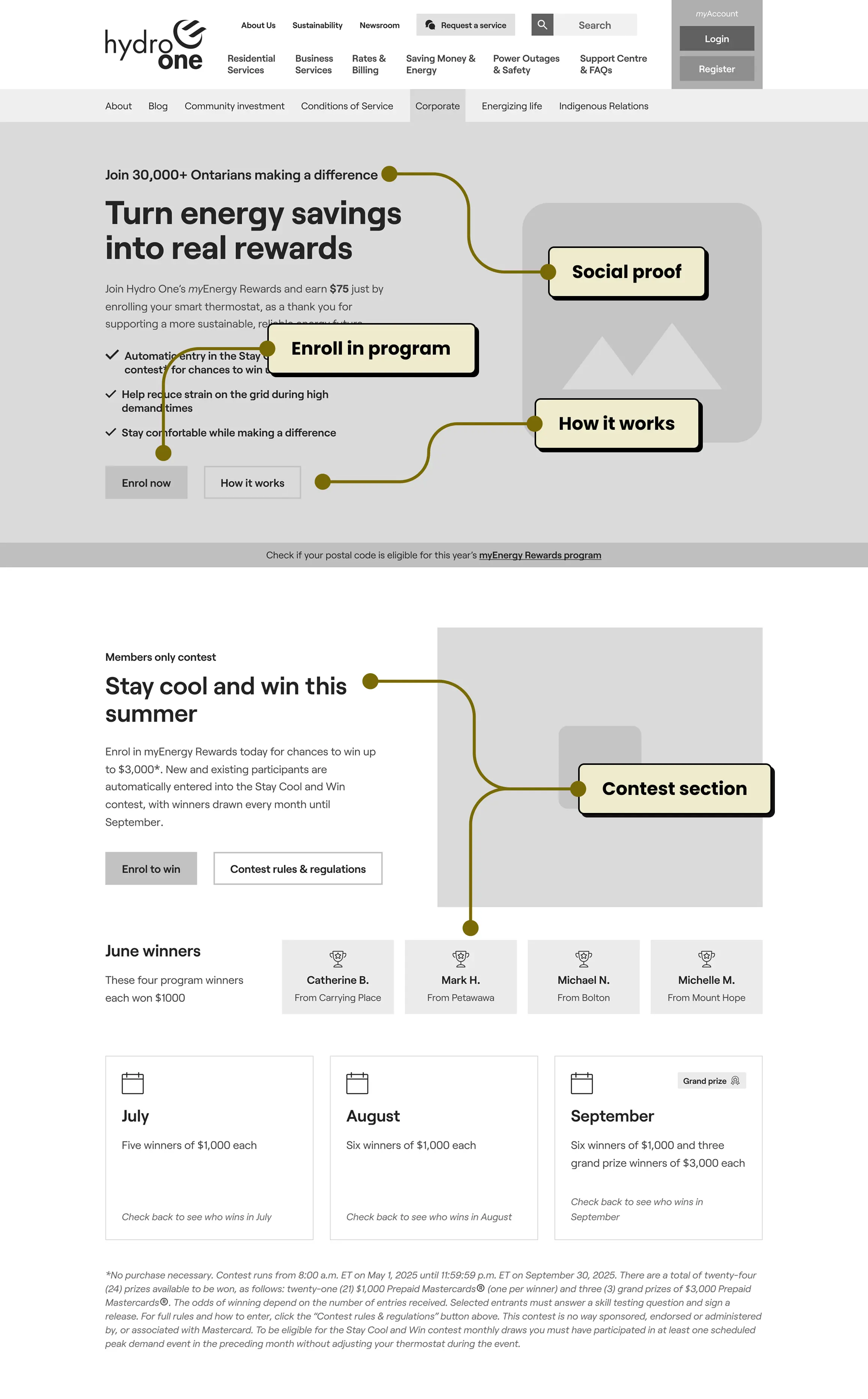
Early Structure
These wireframes focused on layout, hierarchy, and content flow, helping define the core structure before moving into visual design.
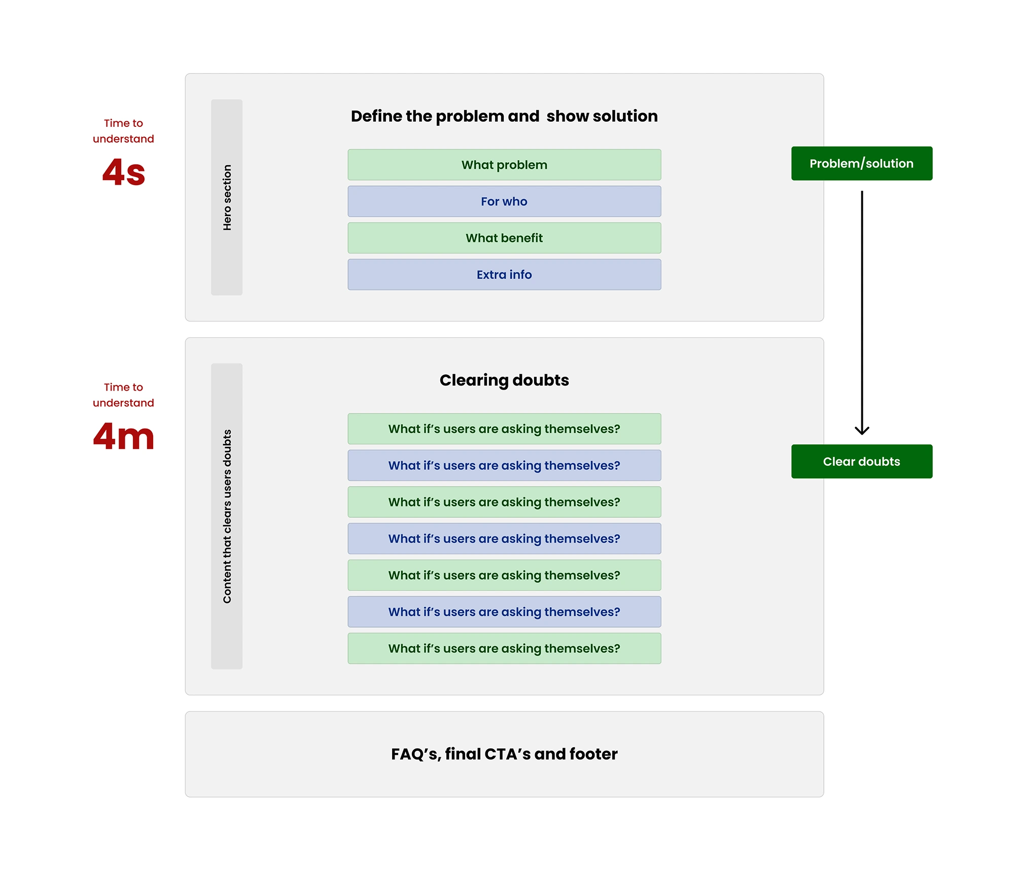
Page Structure Overview
This blueprint highlights the essential building blocks of a strong landing page and how they work together to reduce friction and increase conversions.
Final Direction
Refined visuals, typography, and components were brought together to create a clear, modern, and trustworthy experience for homeowners.
Black 400
#242424
Black 500
#424242
White 100
#FFFFFF
White 200
#E2E2E2
Grounding teal 400
#005866
Grounding teal 500
#1A6976
Grounding teal 550
#257F8B
Vibrant teal 400
#77E9C6
Mint 100
#DDf0EA
Mint 150
#CEE1DB
H1 - Roobert bold
H2 - Roobert semi-bold
H3 - Roobert semi-bold
H4 - Roobert semi-bold
H5 - Roobert Semi-Bold
H6 - Roobert Semi-Bold
Display text SM - Semi-Bold
Display text SM - Regular
Paragraph text SM - Horem ipsum dolor sit amet, consectetur adipiscing elit. Nunc vulputate libero et velit interdum, ac aliquet odio mattis. Class aptent.
Paragraph text MD - Horem ipsum dolor sit amet, consectetur adipiscing elit. Nunc vulputate libero et velit interdum, ac aliquet odio mattis. Class aptent.
Paragraph text LG - Horem ipsum dolor sit amet, consectetur adipiscing elit. Nunc vulputate libero et velit
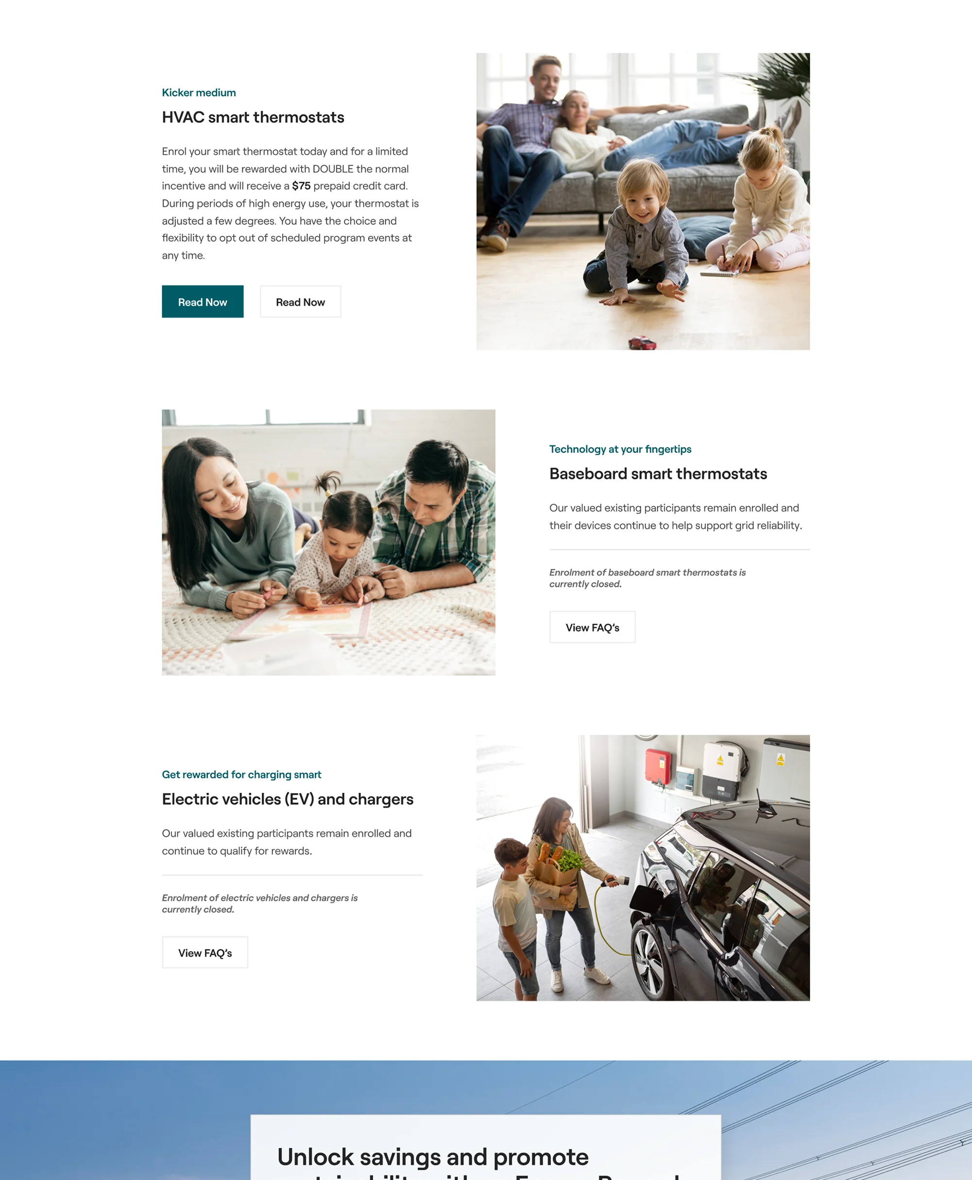
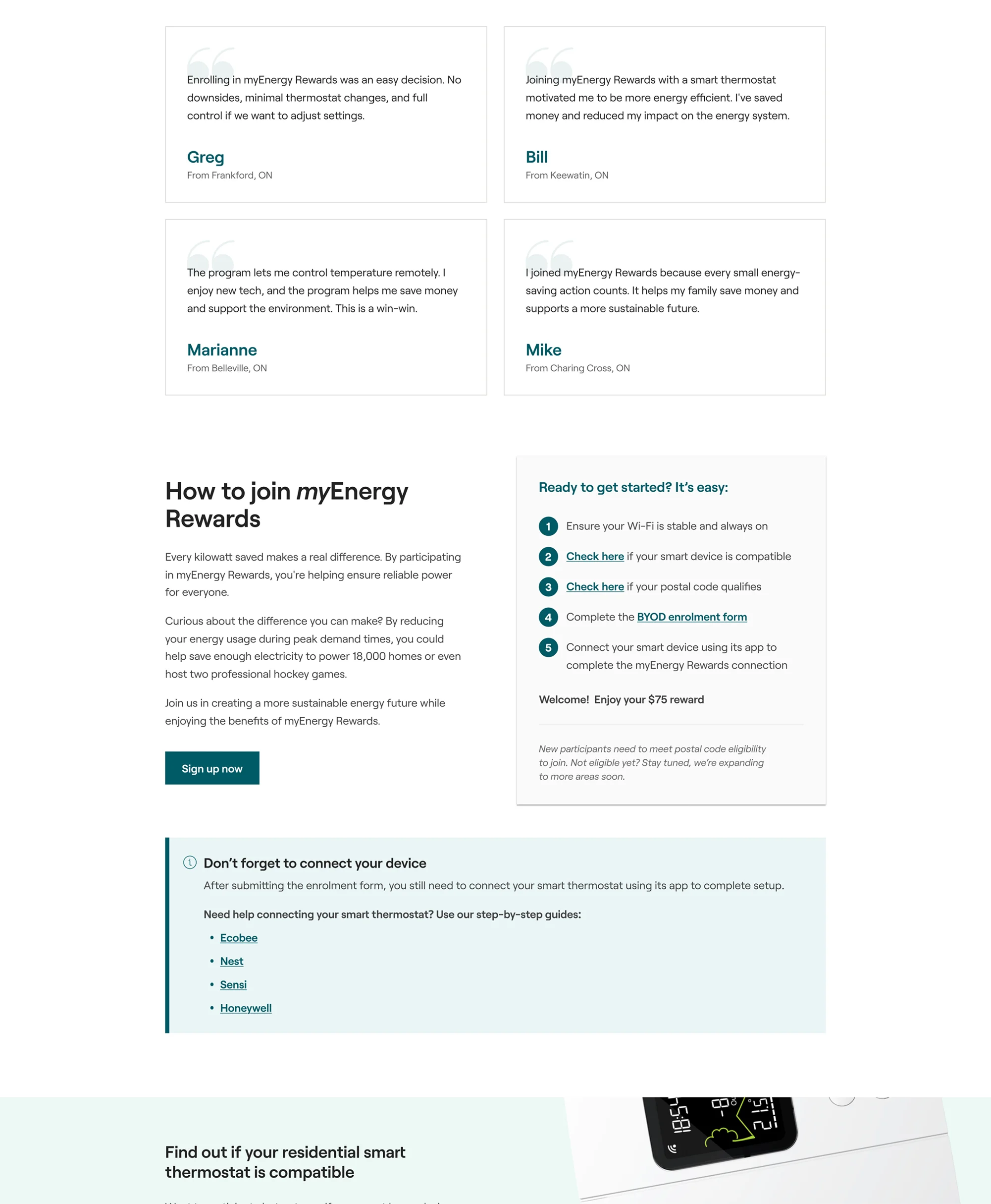
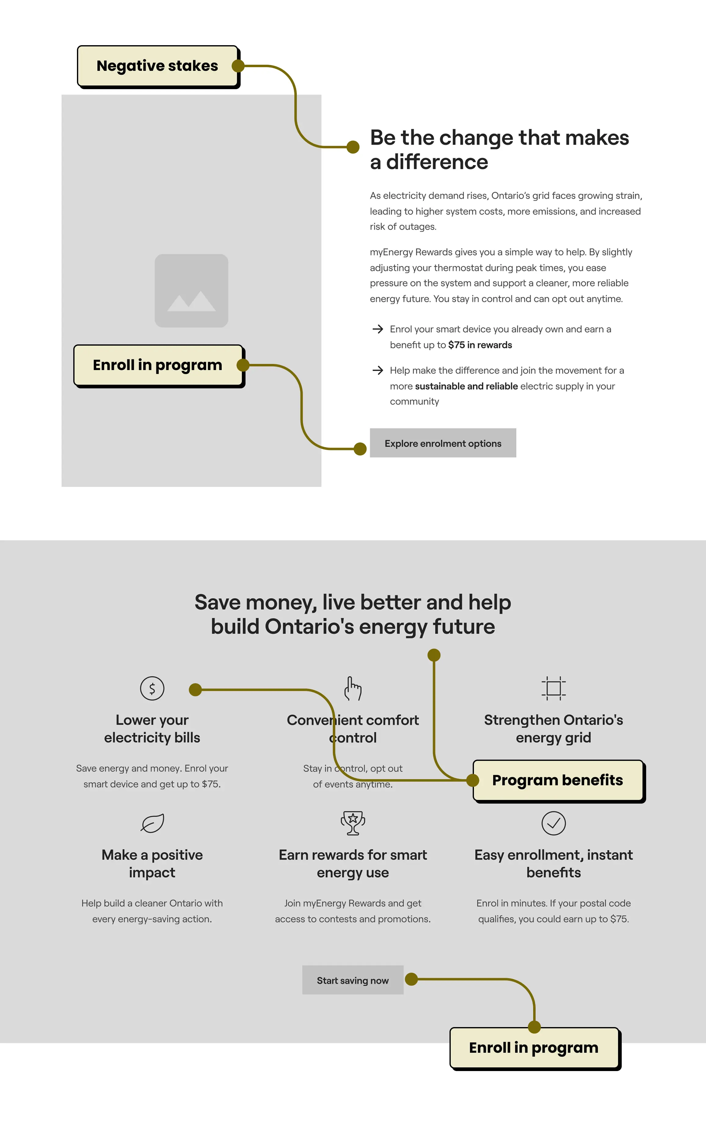
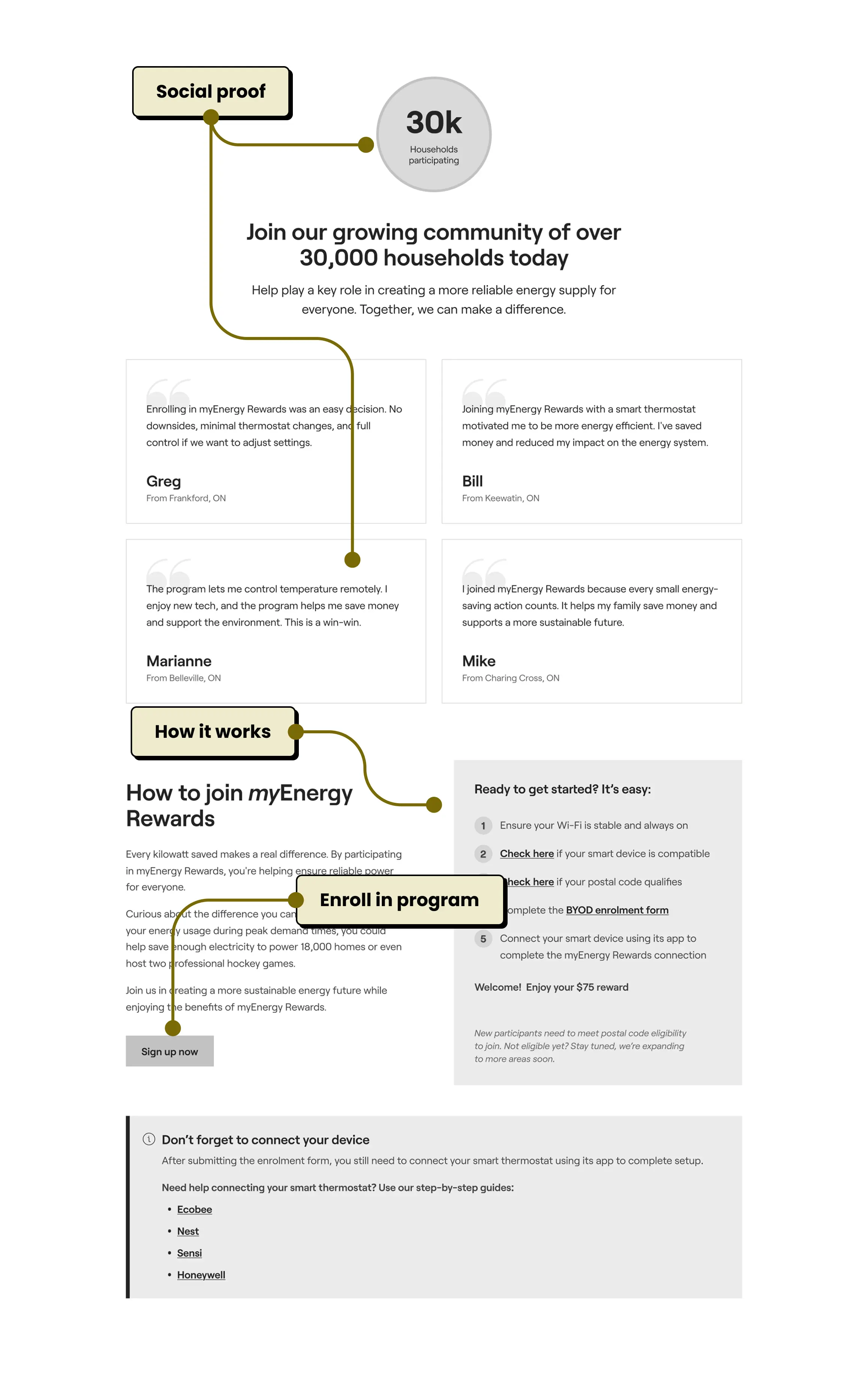
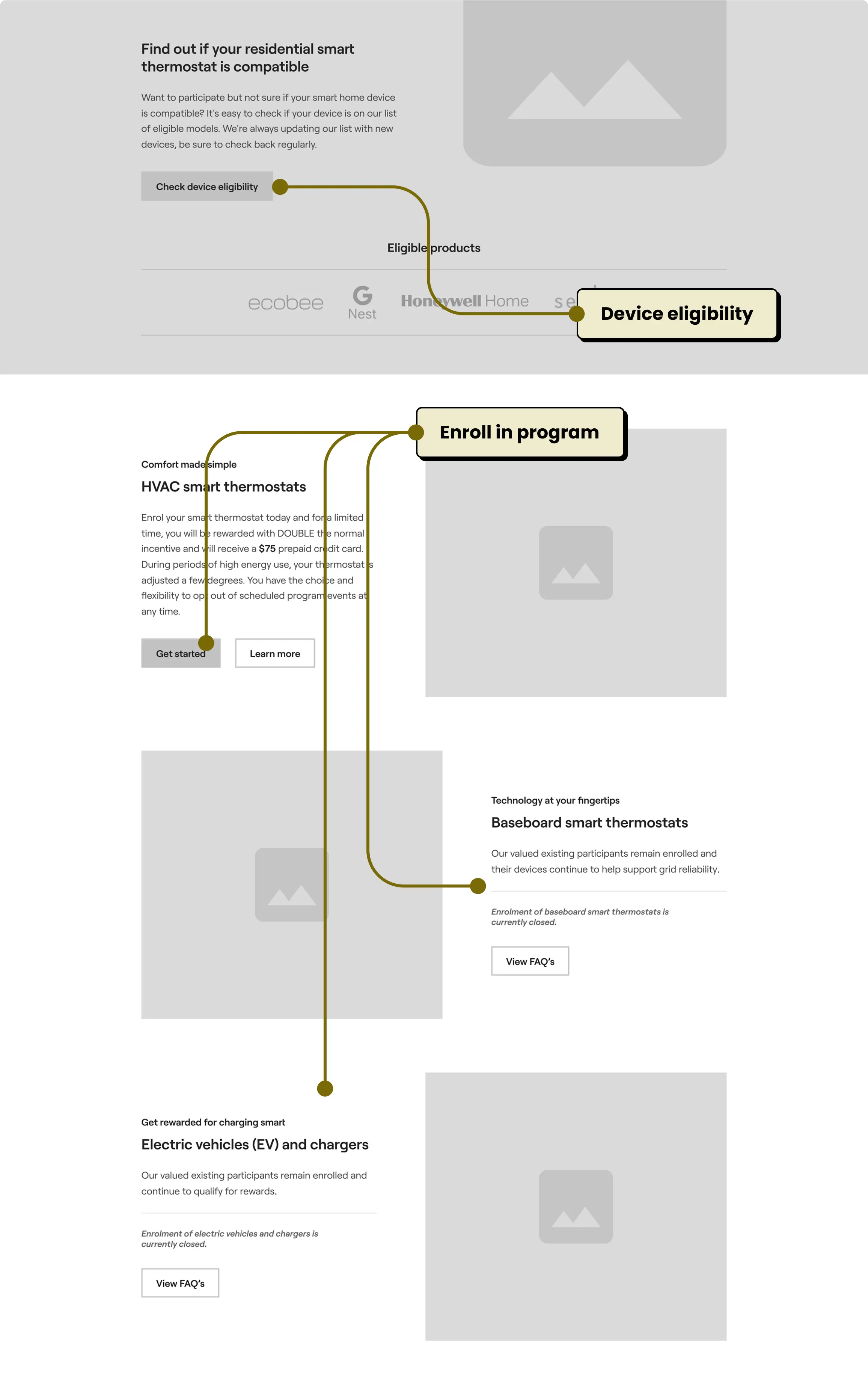
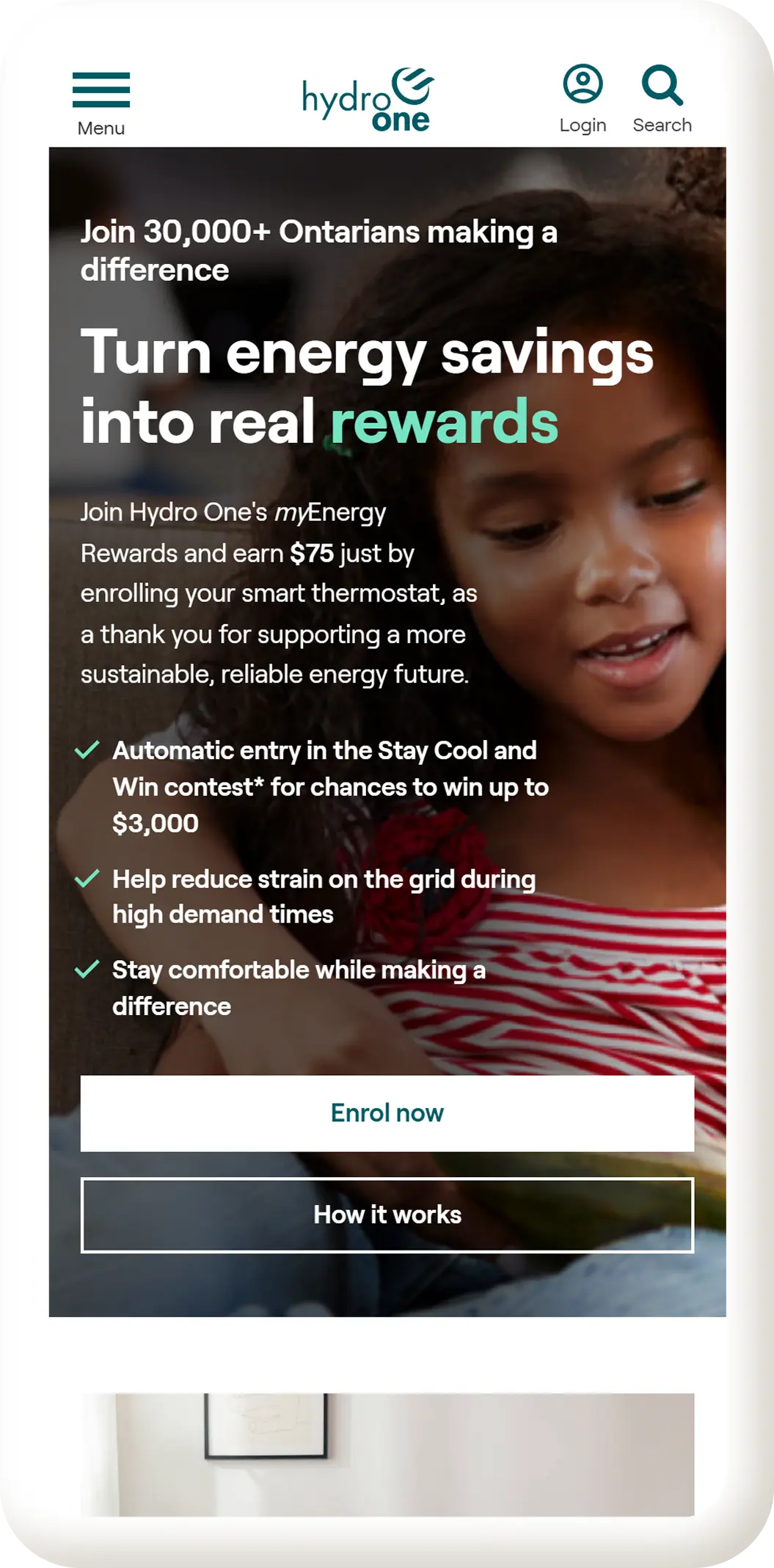
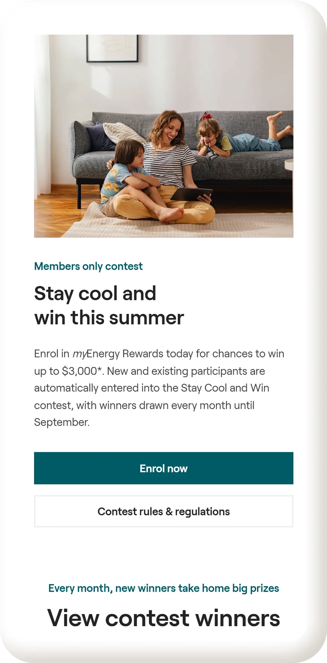
Full Experience
These final screens capture the full redesign, bringing structure, clarity, and visual consistency to the landing page.
View live site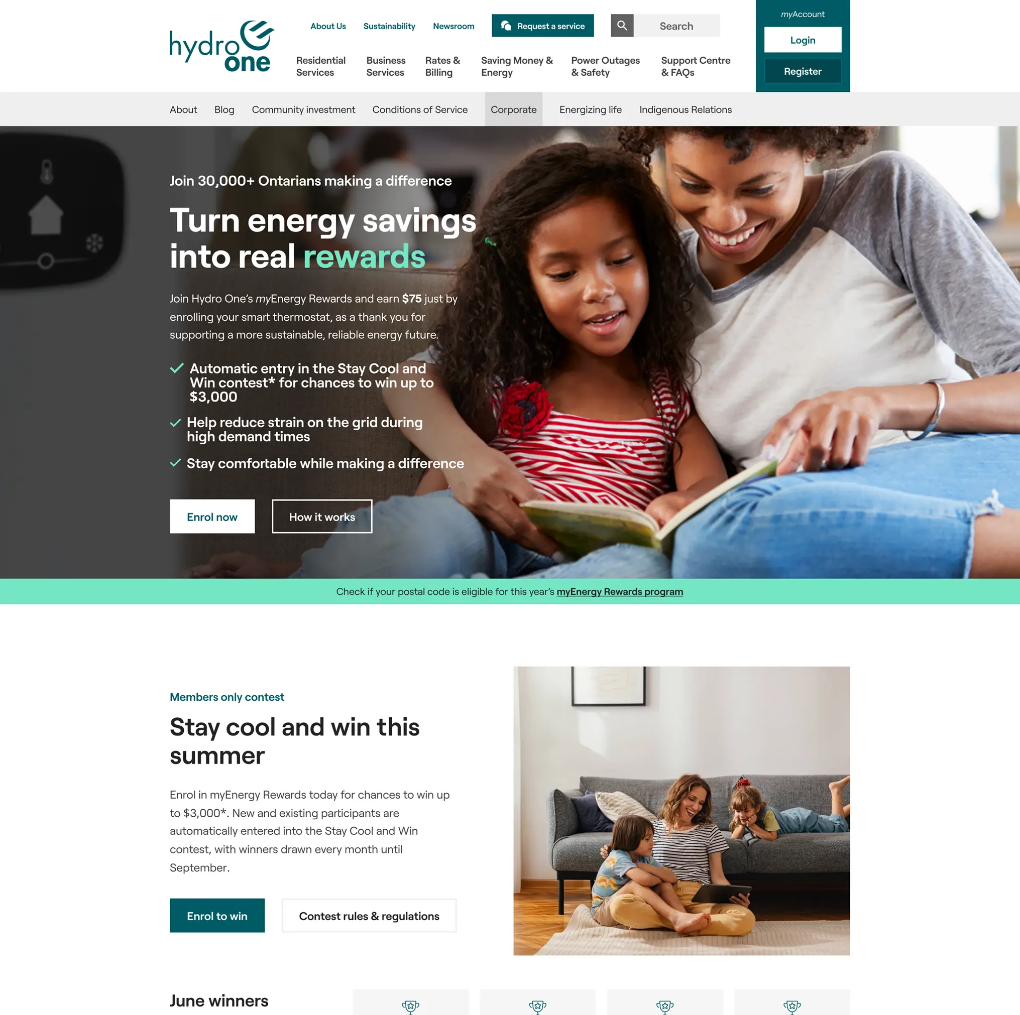
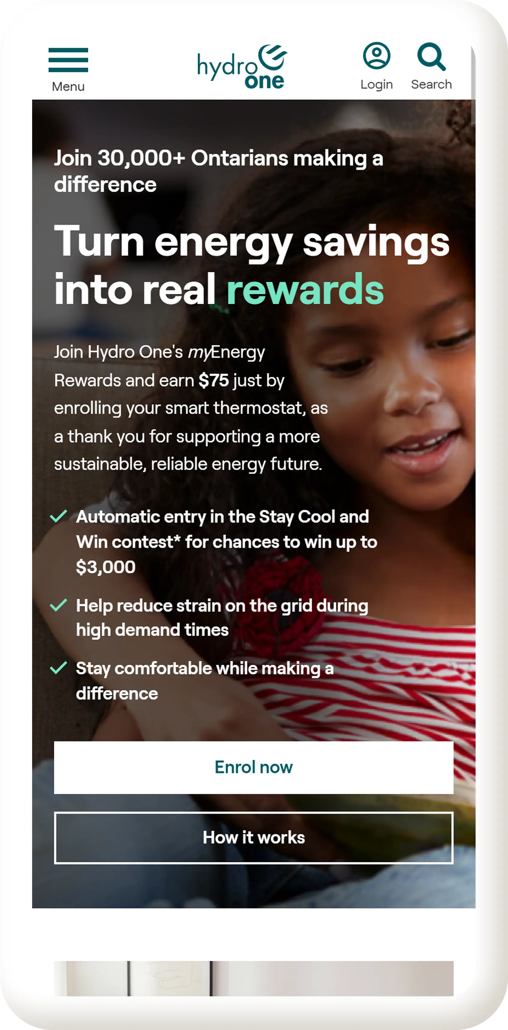
Mobile First
Mobile layouts were refined to maintain strong hierarchy and readability, ensuring users can enroll in the program with minimal friction.
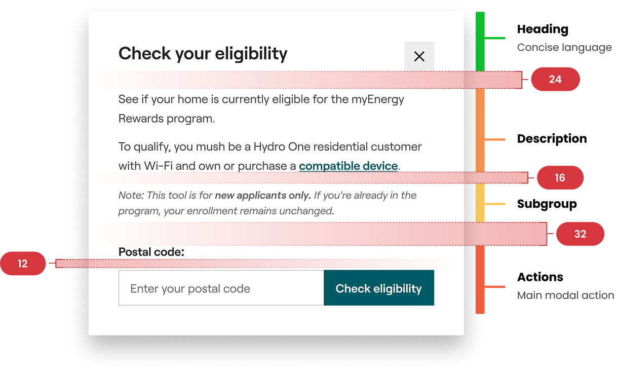
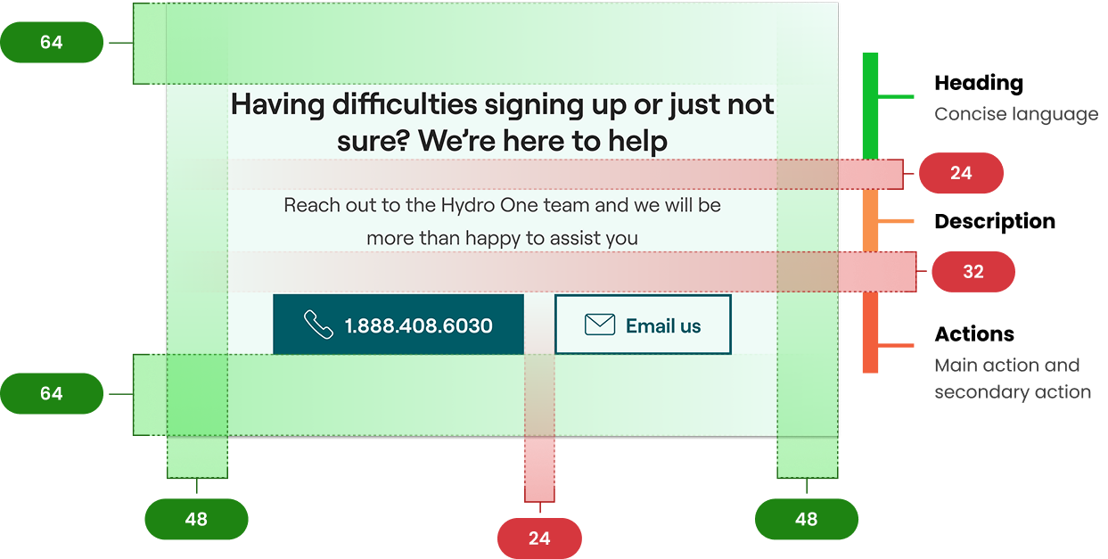
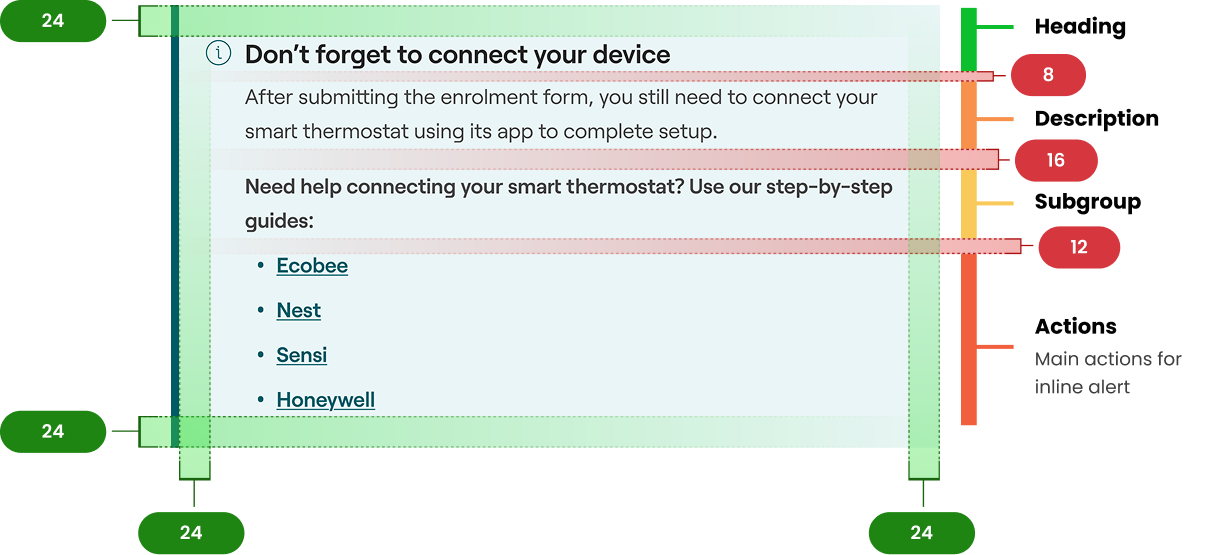
Consistent Spacing
Applying an 8-point grid helped establish predictable spacing and a balanced visual hierarchy throughout the design.
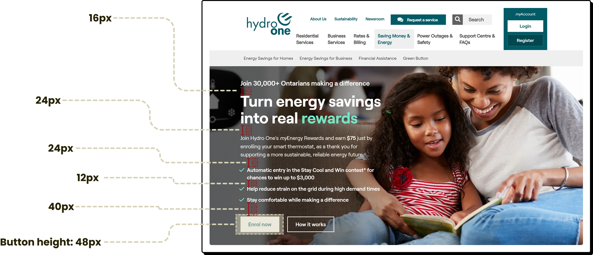
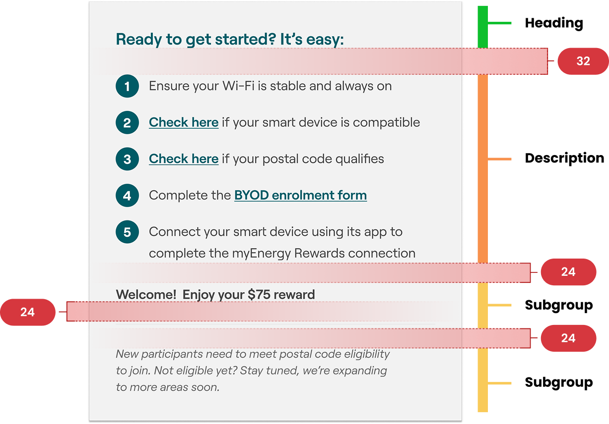
Logical Groups using Hierarchy Strips
Key components were broken down and annotated to highlight spacing, structure, and the system behind each design element.
Refining Through Feedback
User testing revealed several areas of confusion on the landing page, leading to key refinements that improved clarity and usability.
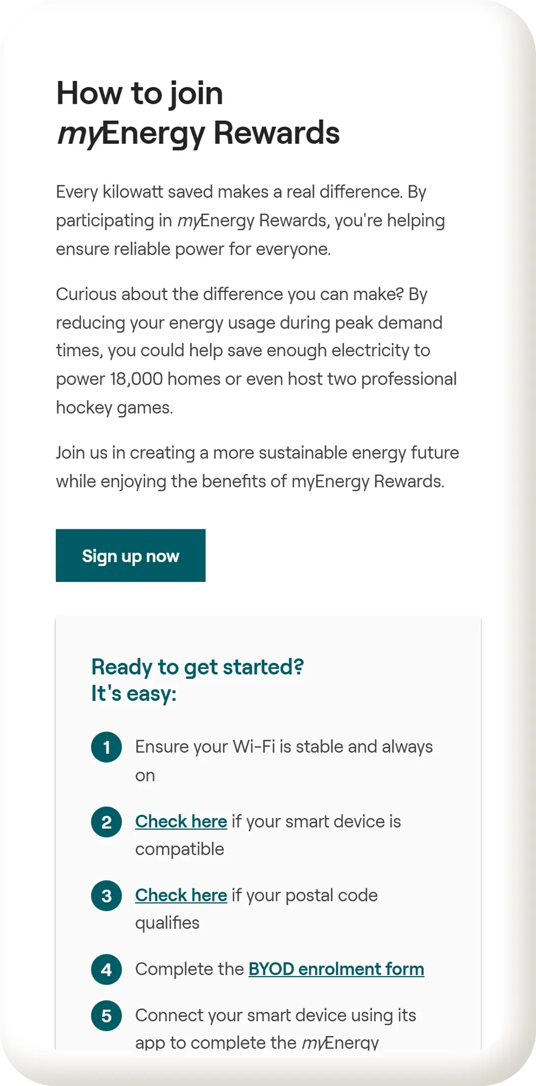
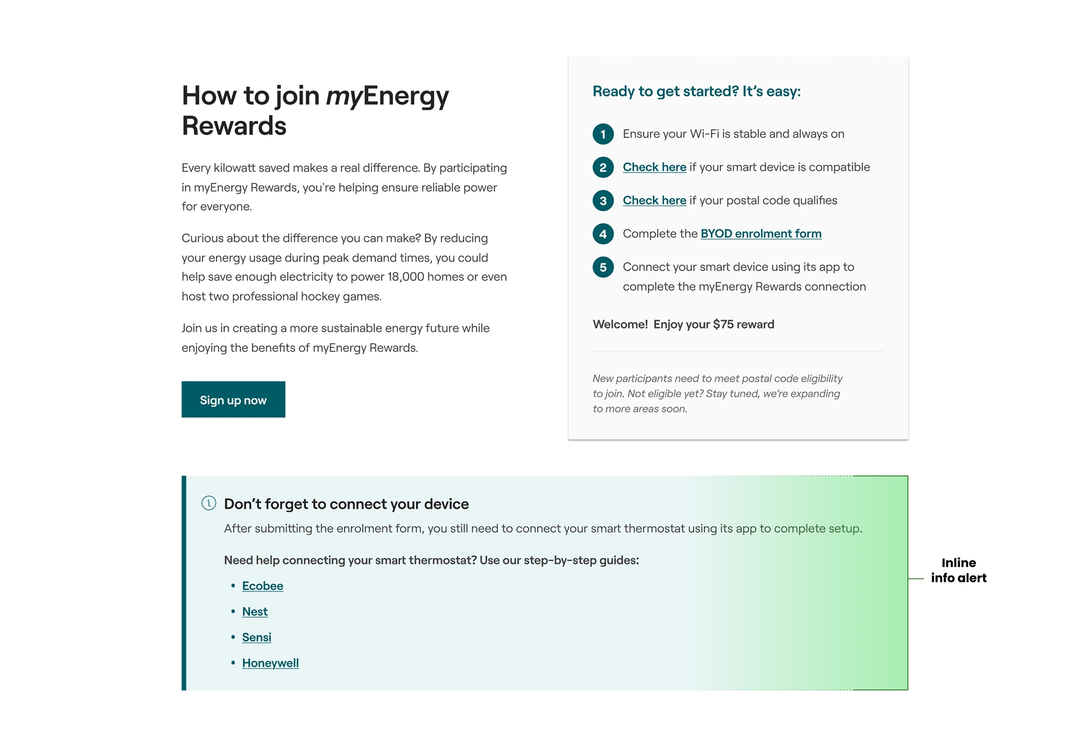
Many users completed the enrollment form but failed to complete the second required step of connecting their smart thermostat through the device's mobile app. This was especially common among Ecobee users and led to incomplete enrollments and increased support requests.
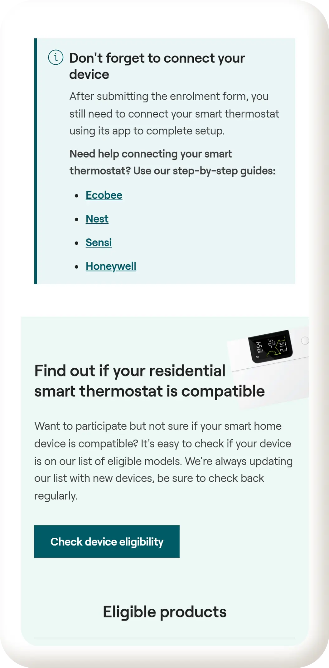
To address this, the two-step enrollment process was clarified on the landing page and in the “How to Join” section. "An inline info alert" was added to remind users that connecting their device via the app is required to finish enrollment.
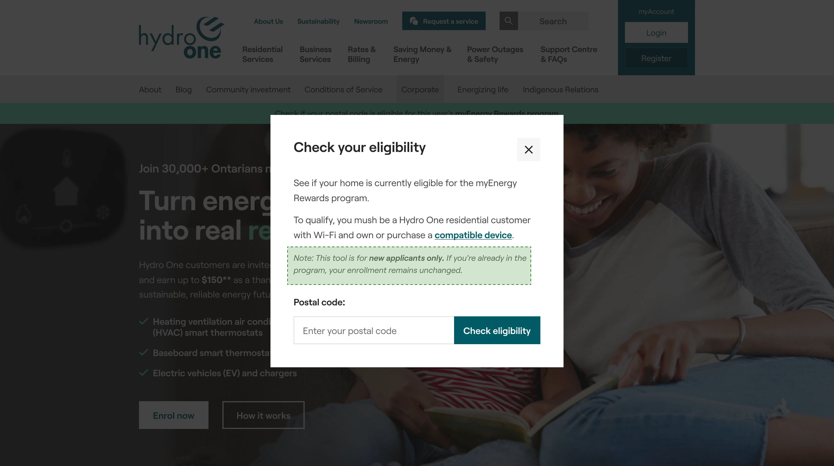
Users were confused when their postal code appeared ineligible, and existing participants worried they might be removed from the program if their area no longer qualified. The eligibility tool did not clearly explain how it applied to current versus new users.
To resolve this, clearer messaging was added to the modal reassuring existing users that their enrollment remains unchanged. "This tool is for new applicants only. If you're already in the program, your enrollment remains unchanged".
From the Client
Honest feedback on the process, partnership, and outcomes delivered through our work together.

Jacob possesses a unique blend of creativity and pragmatism. This harmonious fusion of his design and development prowess consistently culminates in the timely delivery of exceptional outcomes.

Jason Somai
Digital Manager - Hydro One