Jacob Di Domenico
A conversion focused website re-design for a trusted name in pool maintenance.
Landing page redesign
Improving conversion & clarity
April 2025 - May 2025
Designer, researcher, developer

Design Intent
I've always loved the experience of a clean saltwater pool, but I've seen how complicated the maintenance side can be for homeowners. This redesign aims to simplify that journey.
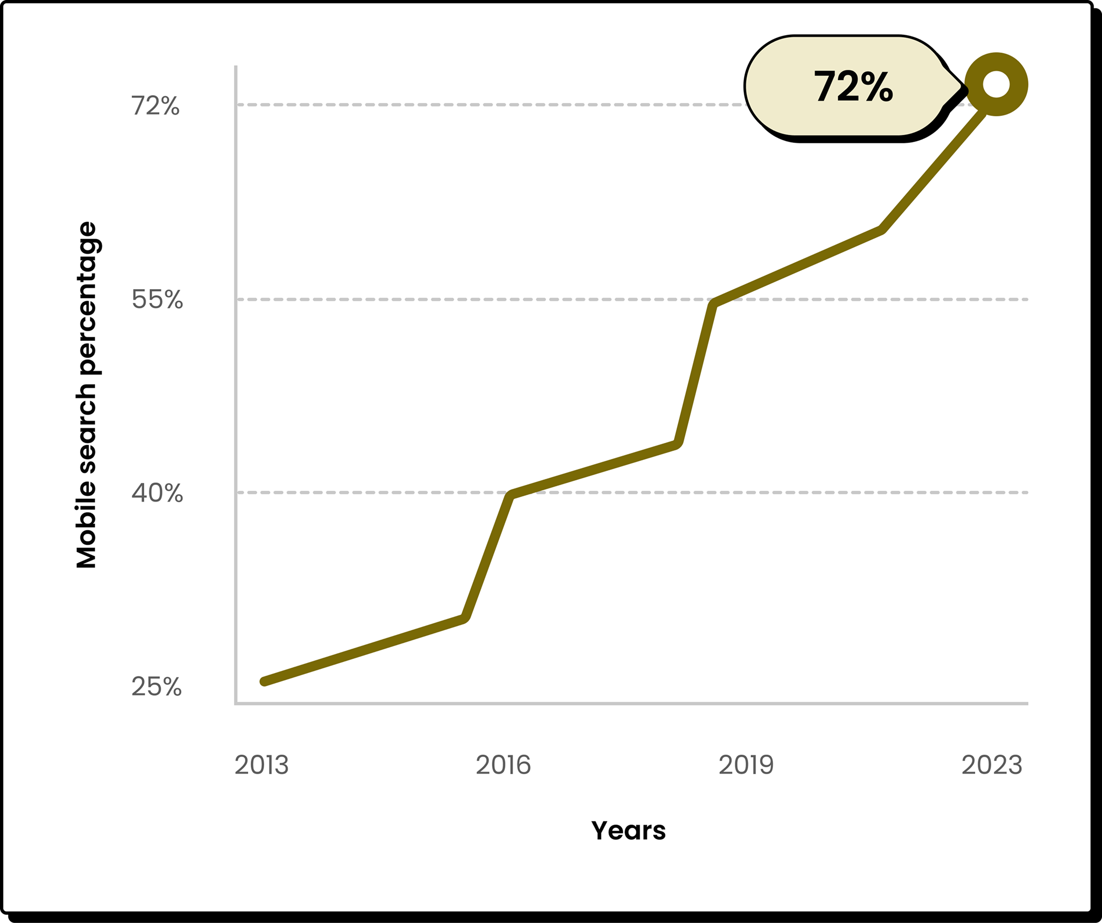
Industry trends
Homeowners expect quick information, mobile-friendly layouts, and transparent service details. Trust signals like reviews and experience heavily influence who they choose.
Most pool service websites don't meet these expectations. Pricing is unclear, value isn't communicated well, and key info is buried in outdated or text-heavy layouts, leading to confusion and drop-off.
Industry benchmarking
A quick review of local competitors helped highlight industry patterns, uncover gaps, and identify opportunities for Tav Pools to stand out.
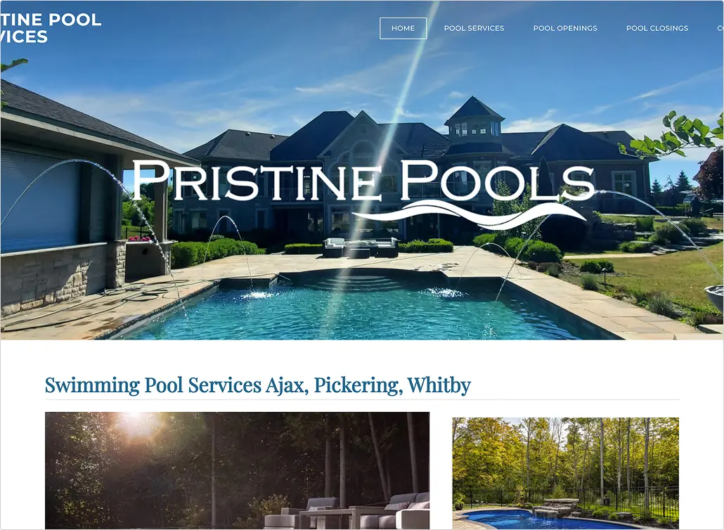
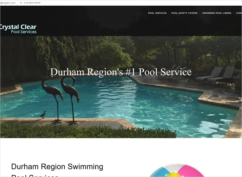
Swim Pristine
Swim Pristine has a modern, polished design with strong branding and high-quality visuals. Their services are clearly presented, trust signals are used well, and contacting the business is straightforward.
They don't showcase product offerings, limiting opportunities for up selling. Some content feels generic, and CTA placement could be stronger and more action-driven.
They excel at clearly listing their pool services and focusing on the local Durham market. Important contact info is easy to find, and customer testimonials add credibility.
The design feels dated and isn't optimized for mobile. Navigation and content depth are limited, CTAs lack visibility, and they don't offer any e-commerce options.
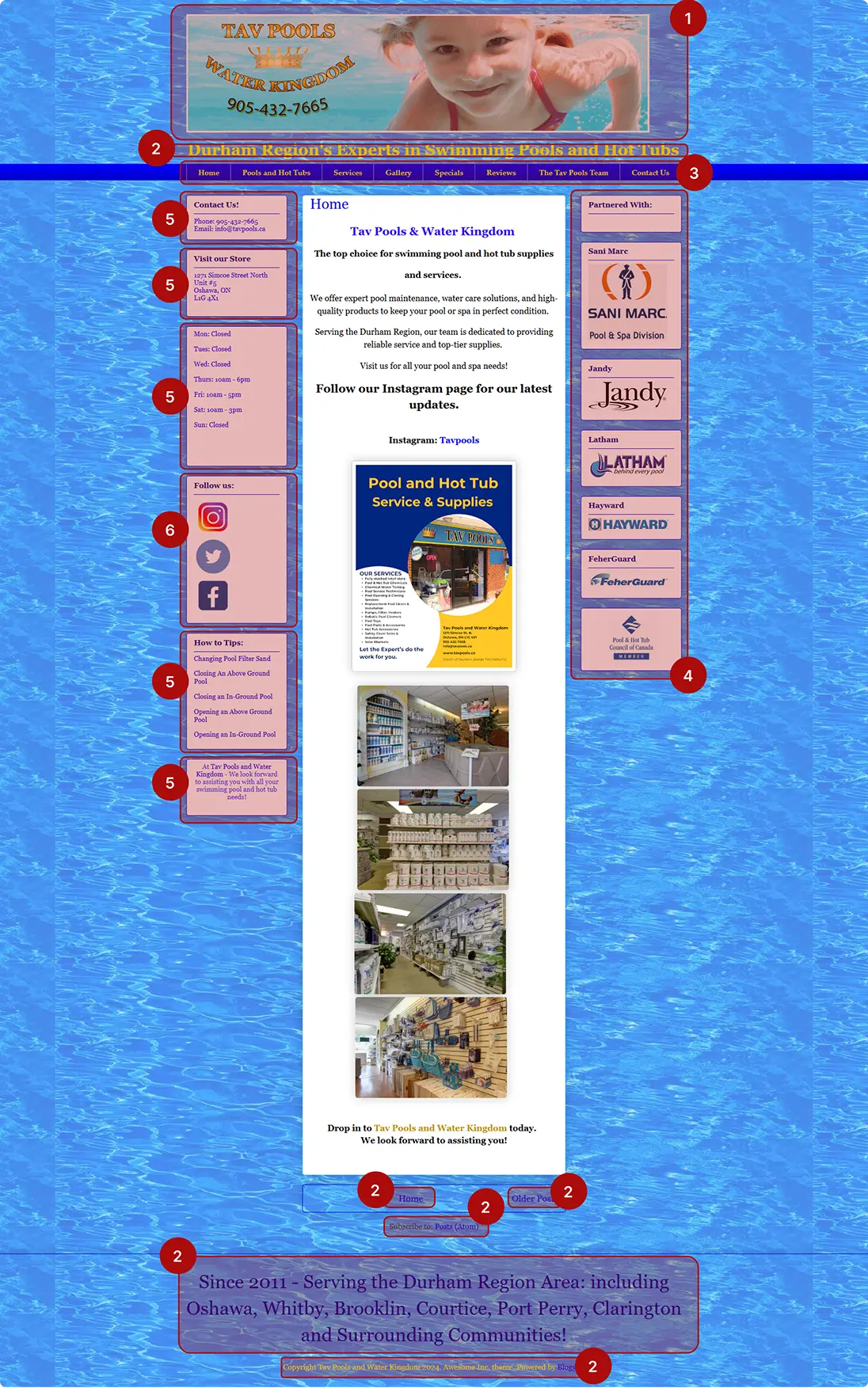
Crystal Clear Pools
User feedback
A quick user survey helped highlight what worked, what caused friction, and where the redesign could better support real homeowner needs.
(Rate 1-5, with 1 being very difficult and 5 being very easy)
(Participants answered Yes or No)
(Participants answered Yes or No)
(Participants answered Yes or No)
(Participants answered Yes or No)
(Participants answered Yes or No)
Insights from participants
The design feels very outdated and overwhelming. There's a lot of text and information crammed onto every page, which makes it hard to focus or know where to look first.
Survey participant
Anonymous pool owner
It looks like a website from the early 2000s. The colors, fonts, and layout make the experience feel cluttered, and it’s tough to quickly understand what's important.
Survey participant
Anonymous pool owner
There's so much going on visually that I felt lost. It was difficult to find the main services or what the company actually does without scrolling through long blocks of text.
Survey participant
Anonymous pool owner
Insight-Driven Design
User surveys reveal insights you can't see on your own. Gathering feedback early helped validate assumptions, uncover blind spots, and ground the redesign in real user needs.

Our users
A research-driven persona helped clarify user goals, frustrations, and expectations, guiding the direction of the redesign.
Daniel Reed
First-time pool owner
To easily understand what services are available
To keep his pool clean, safe, and low-maintenance all summer
To quickly compare pricing or get a clear estimate
To find a trustworthy, local company he can rely on
Information overload on old or outdated websites
Confusing service descriptions that don't explain what's included
Difficulty reaching someone or booking a service online
Inconsistent communication from contractors
34
IT Specialist
Whitby, Ontario
Daniel is a 34-year-old homeowner living in Whitby. He recently bought a house with a pool and is still learning what proper pool care involves. Between work and family life, he doesn't have the time (or desire) to figure out maintenance on his own. He just wants reliable service and simple, clear information.
Daniel values clarity, trust, and convenience. If a company meets those expectations, he's likely to become a long-term loyal customer.
Expert review
Reviewing the old website through UX heuristics made it clear where users were struggling and where the design needed to be more intuitive.
No defined hero structure. Missing a clear H1, supporting copy, or CTA. Users don't immediately understand the service offering or why Tav Pools is a trusted choice.
Multiple sections fail WCAG contrast standards. Low-contrast text and backgrounds make content difficult to read and harm overall accessibility.
The nav menu fails the heuristic of recognition over recall. With 8+ similar-looking links and no grouping, users must manually scan everything to locate the right page.
Sponsor logos are helpful but visually overpowering. They need consistent sizing and muted styling so they support, rather than distract from, the main goal of contacting Tav Pools.
The primary blue is overused across headings, text, and UI elements. When everything uses the same color, nothing stands out. This reduces visual hierarchy and makes CTAs harder to identify. The primary color should be reserved for actions and key interactive elements.
Social icons are too large and visually dominant. They should be consistent in size and color, and positioned in the footer to avoid distracting users or encouraging them to leave the site prematurely.
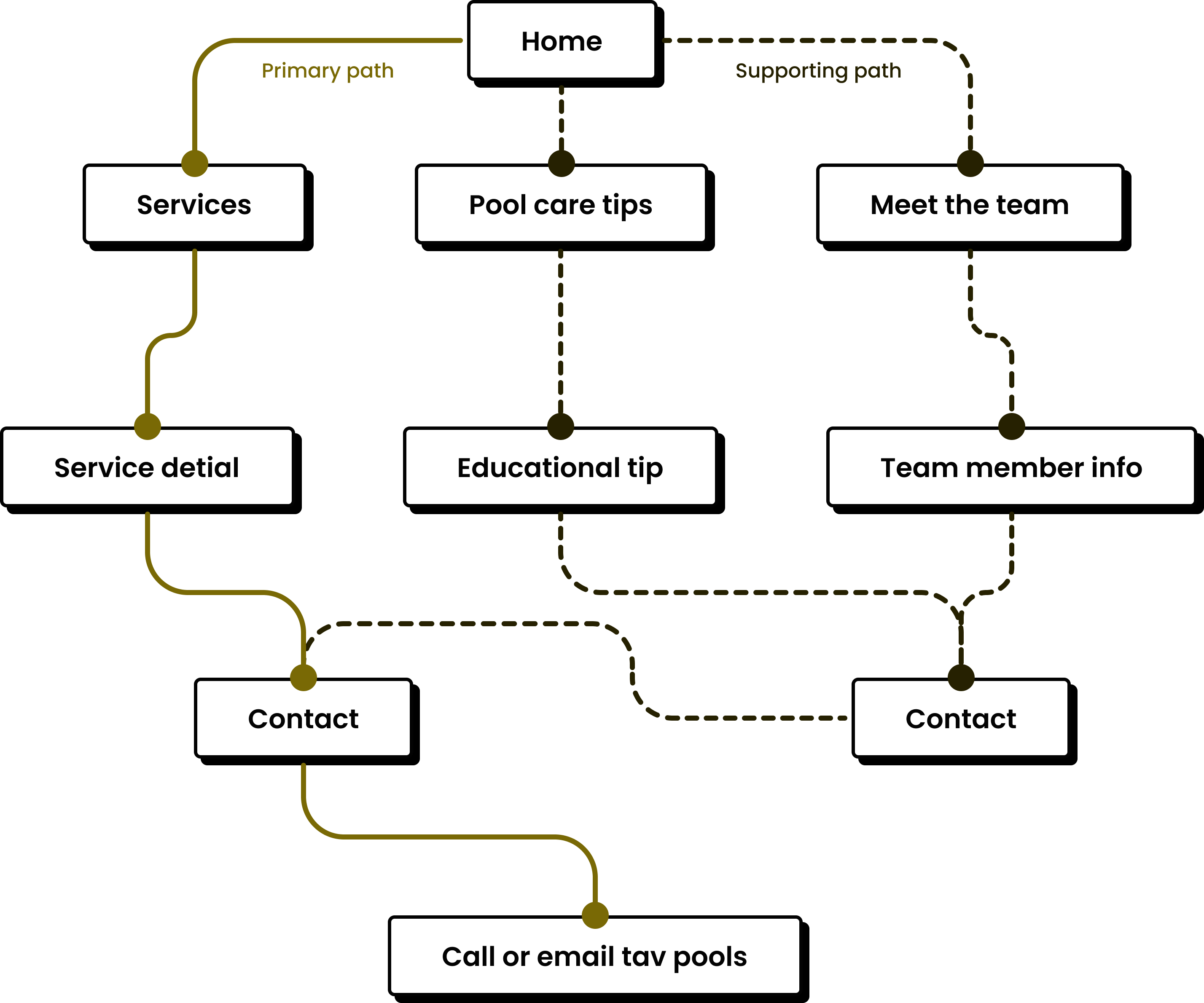
Understanding the Path
A simple user flow helped clarify how homeowners move through the site and where the design should guide them toward contacting Tav Pools.
Early Structure
These wireframes focused on layout, hierarchy, and content flow, helping define the core structure before moving into visual design.
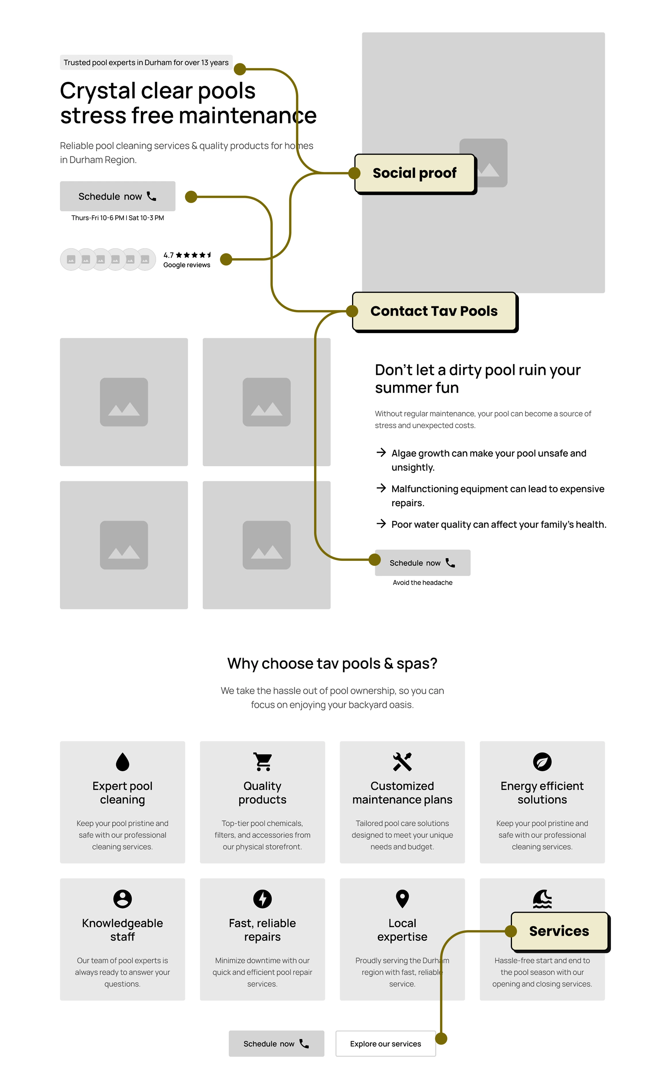
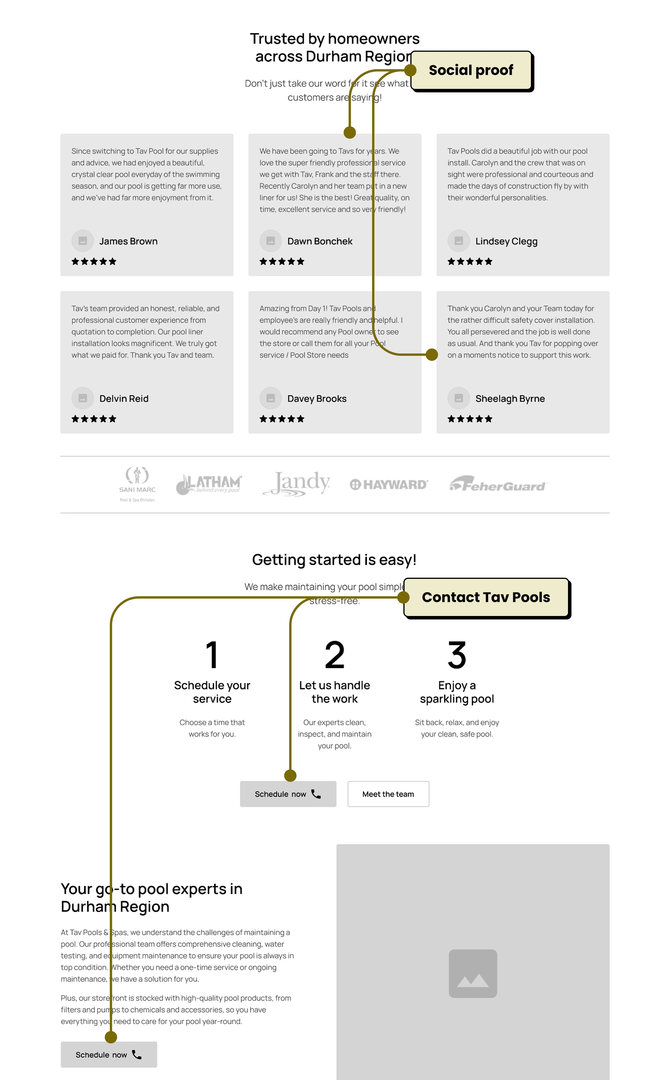
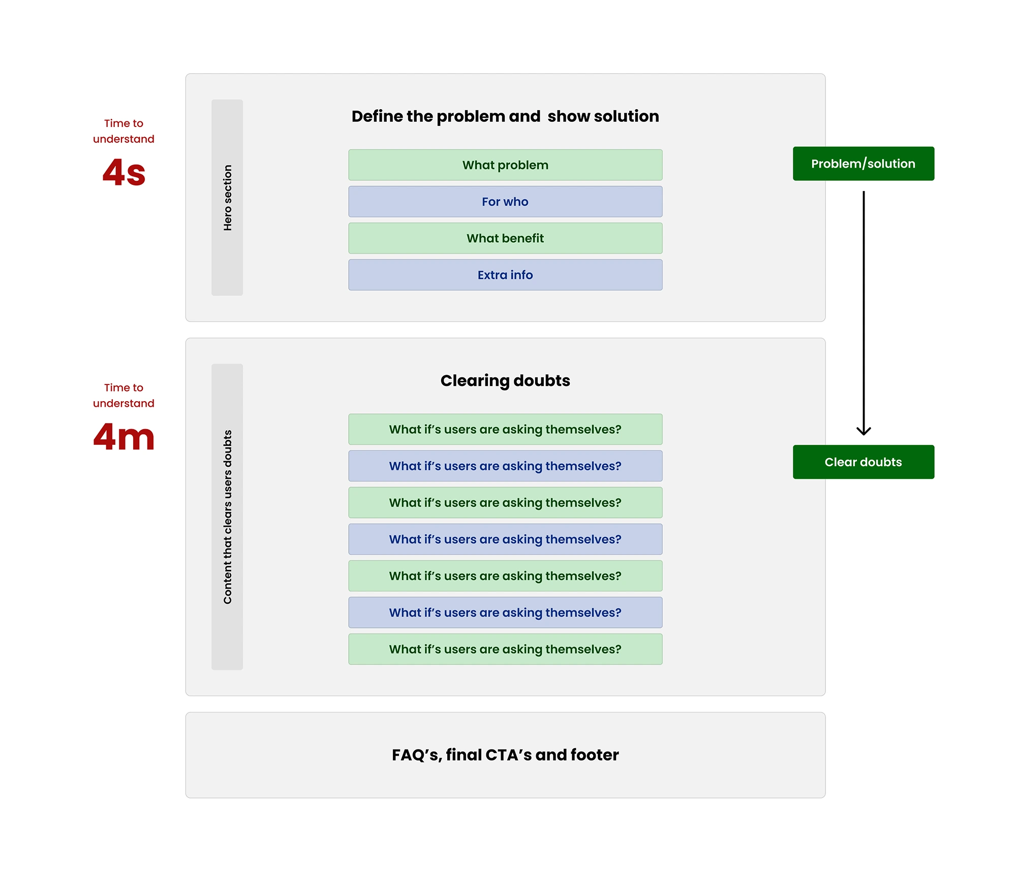
Page Structure Overview
This blueprint highlights the essential building blocks of a strong landing page and how they work together to reduce friction and increase conversions.
Final Direction
Refined visuals, typography, and components were brought together to create a clear, modern, and trustworthy experience for homeowners.
Black 400
#030303
Black 300
#3D3D3D
White 100
#FFFFFF
White 150
#E2E2E2
White 200
#D7D7D7
White 300
#AEAEAE
Blue 100
#E8EDF3
Blue 150
#DCE3EB
Blue 200
#CBD3DC
Blue 400
#00267F
Blue 450
#0A2140
Blue 500
#06162C
H1 - Manrope semi-bold
H2 - Manrope semi-bold
H3 - Manrope semi-bold
H4 - Manrope semi-bold
H5 - Manrope Semi-Bold
H6 - Manrope Semi-Bold
Display text LG
Display text SM - Semi-Bold
Display text SM - Regular
Paragraph text SM - Horem ipsum dolor sit amet, consectetur adipiscing elit. Nunc vulputate libero et velit interdum, ac aliquet odio mattis. Class aptent.
Paragraph text MD - Horem ipsum dolor sit amet, consectetur adipiscing elit. Nunc vulputate libero et velit interdum, ac aliquet odio mattis. Class aptent.
Paragraph text LG - Horem ipsum dolor sit amet, consectetur adipiscing elit. Nunc vulputate libero et velit
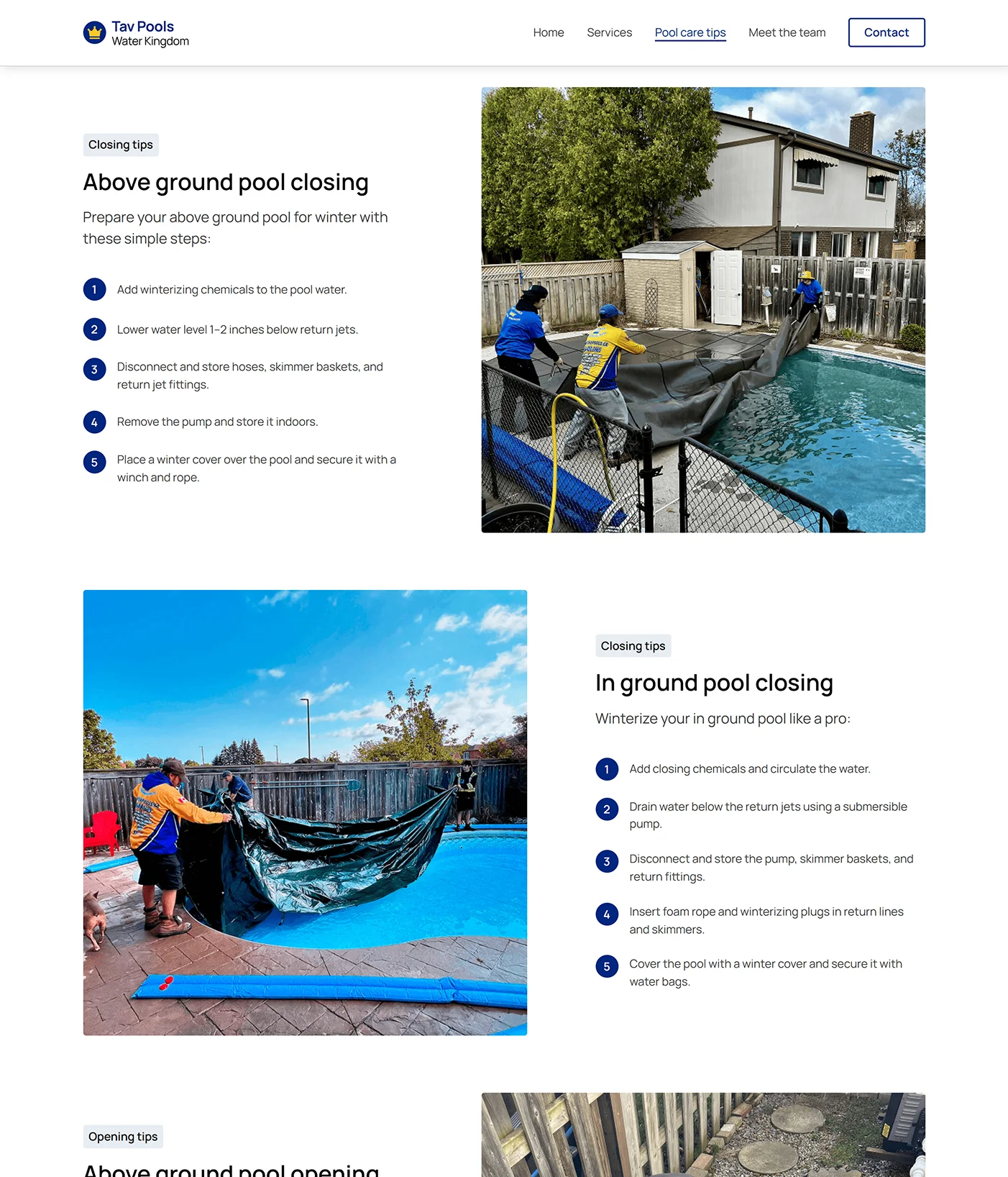
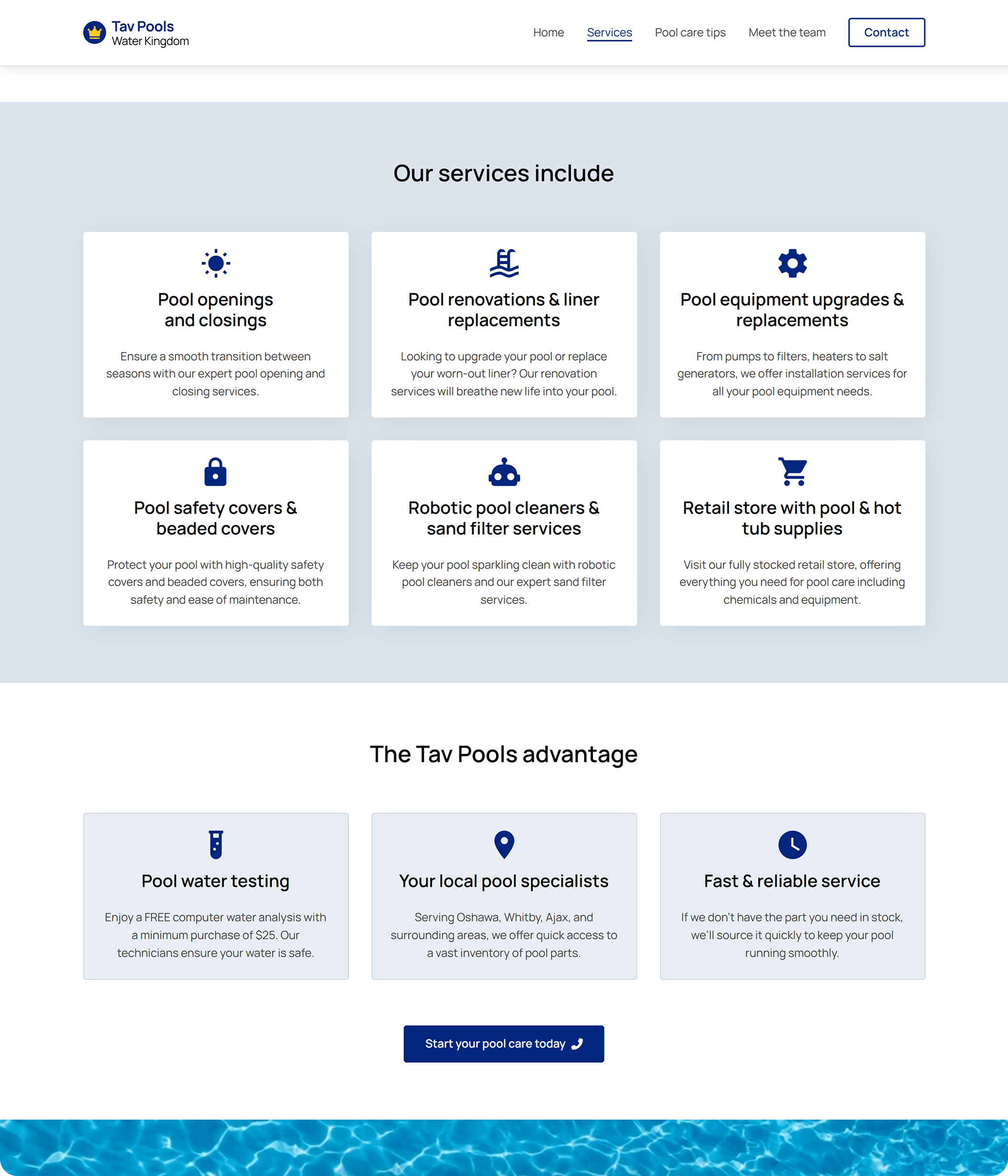
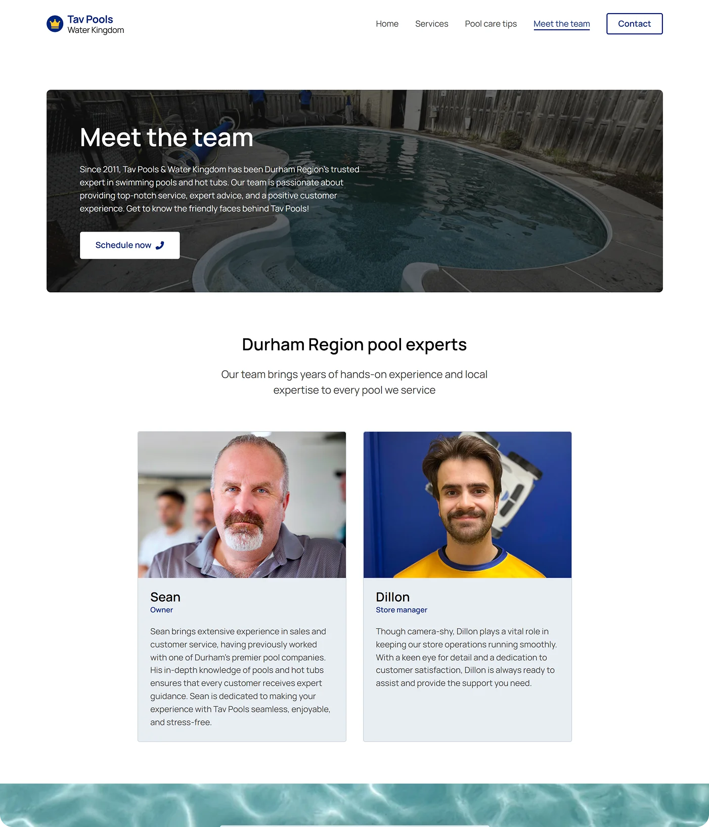
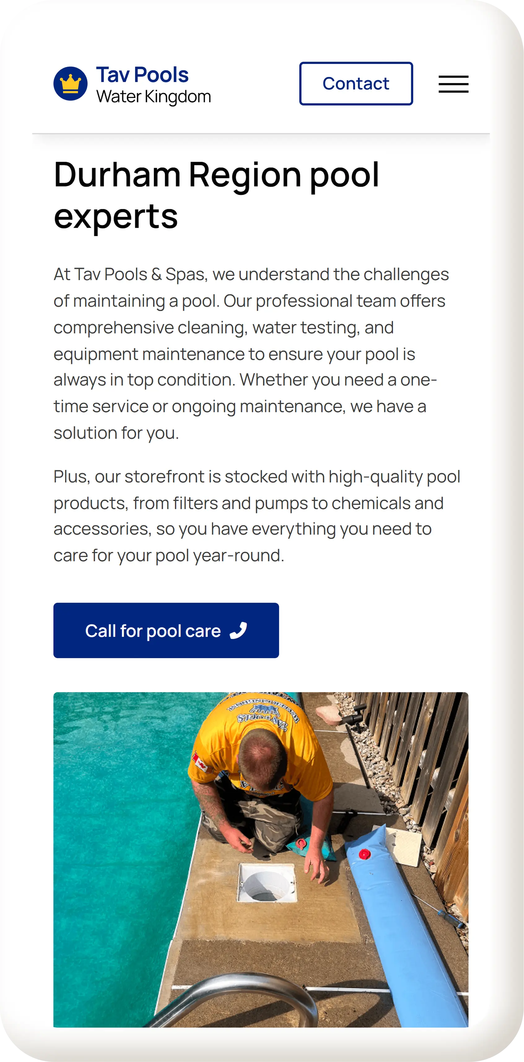
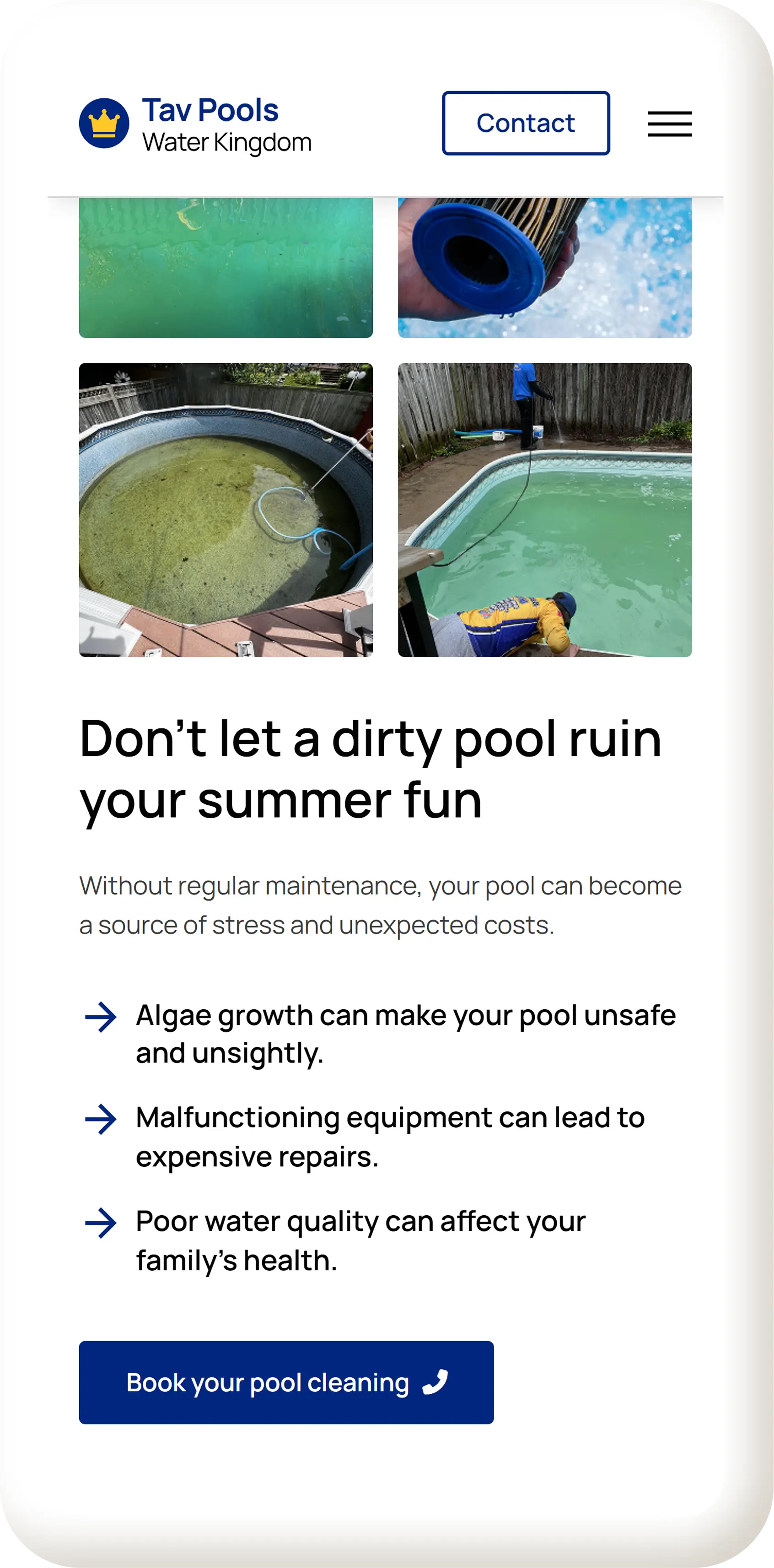
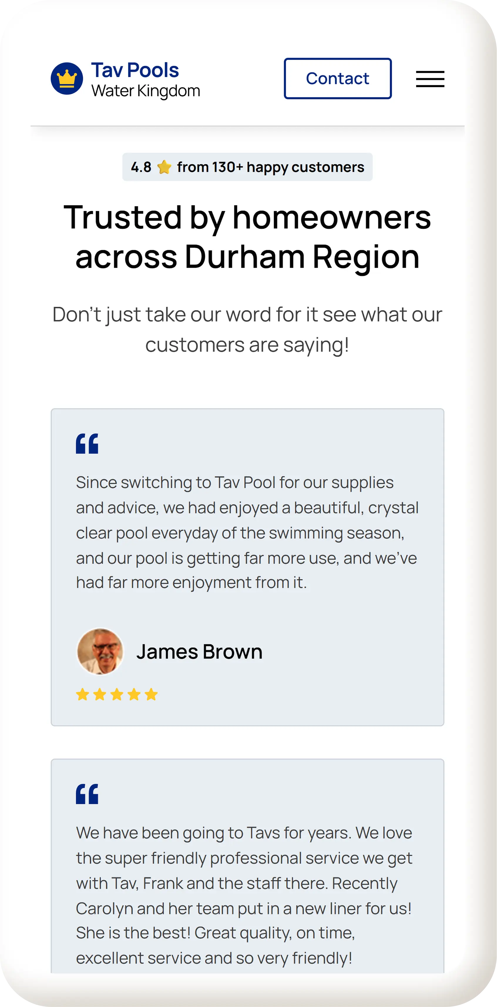
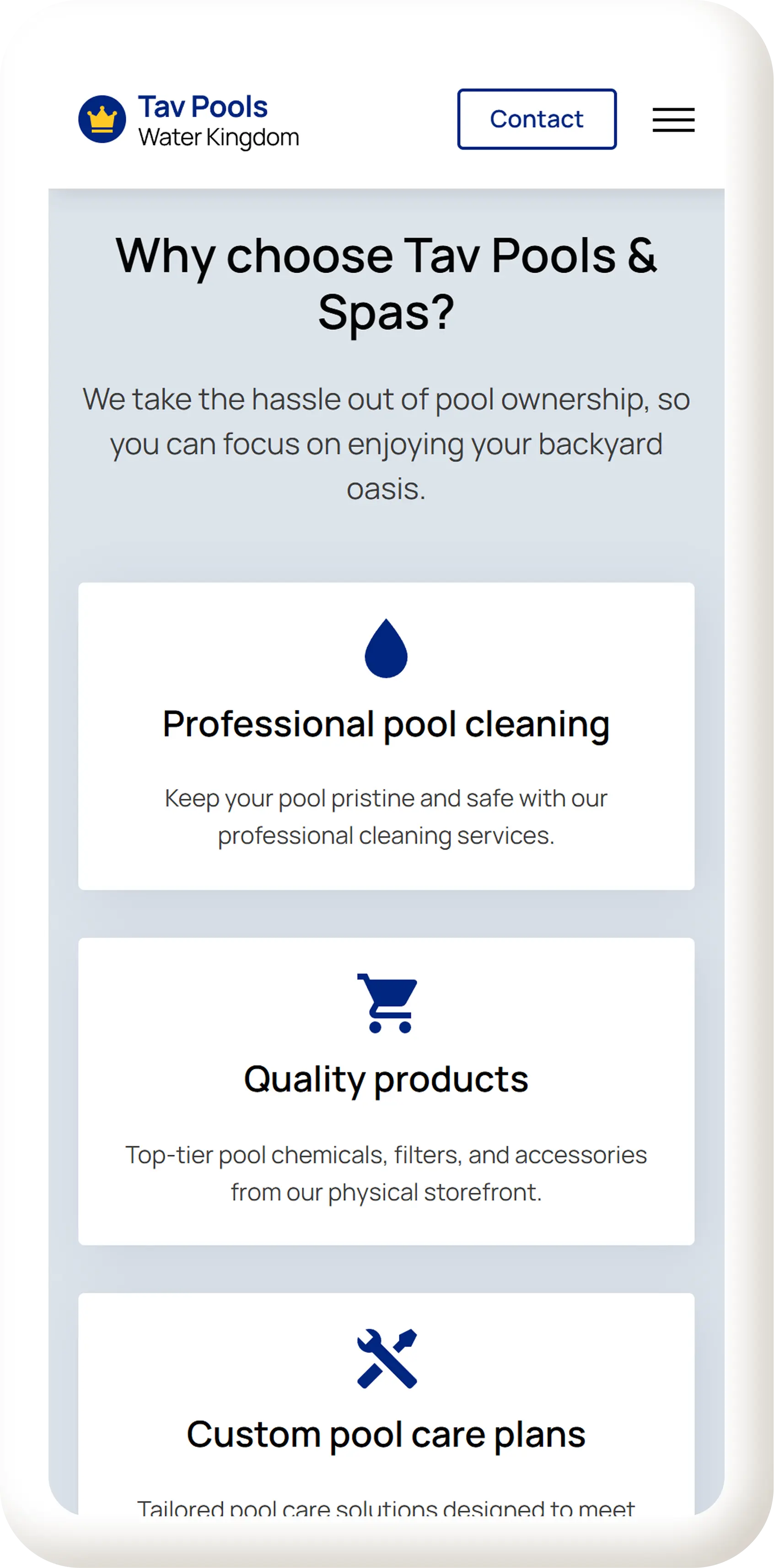
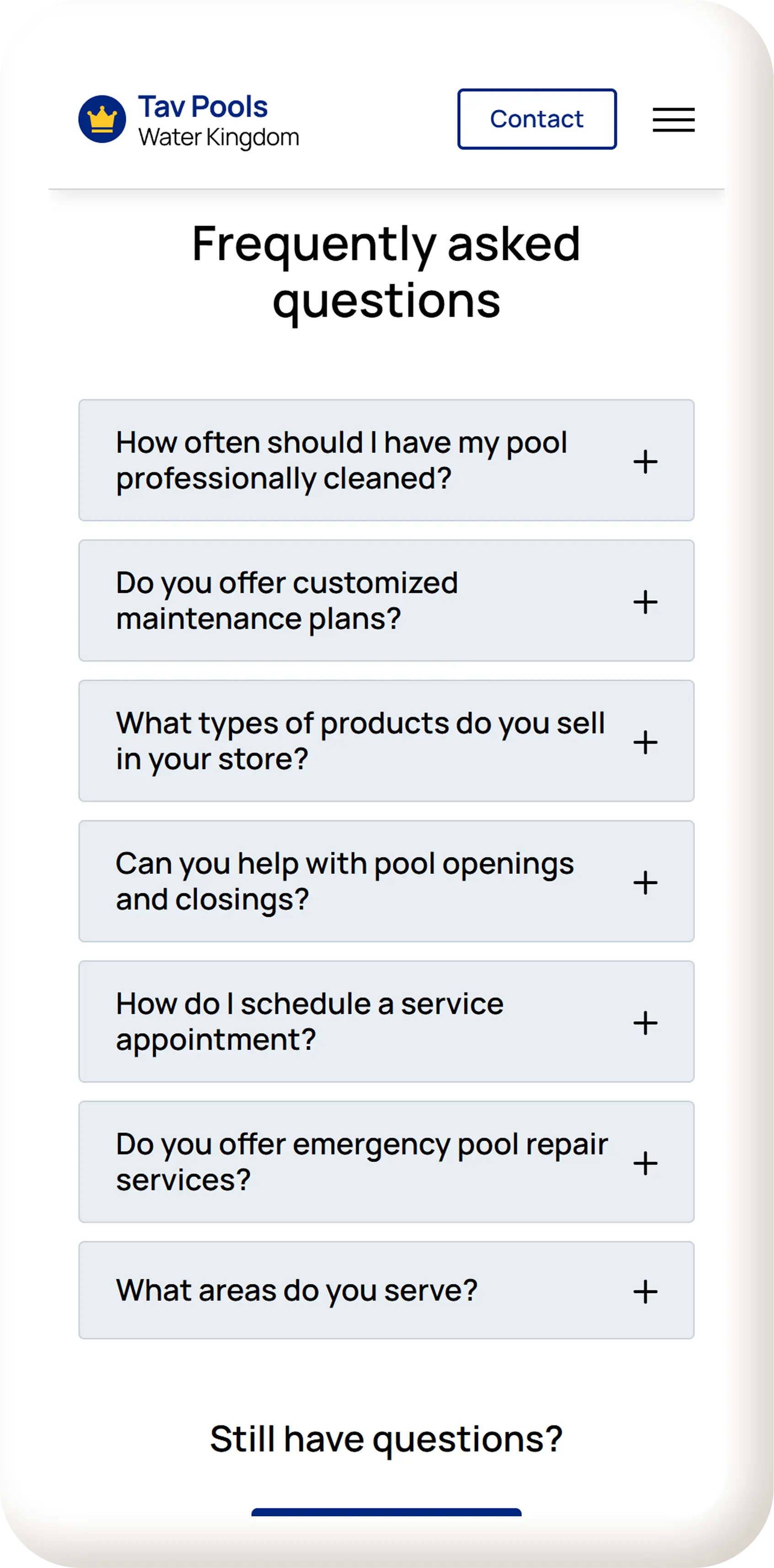
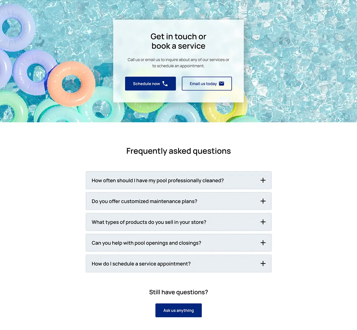
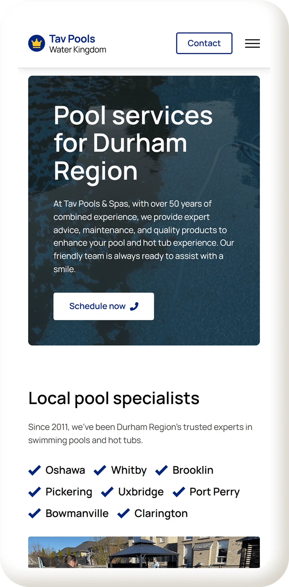
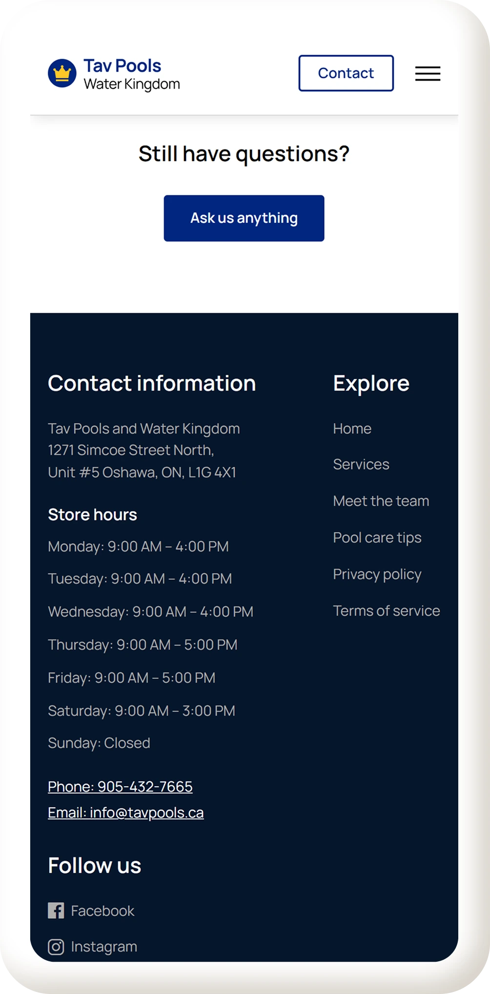
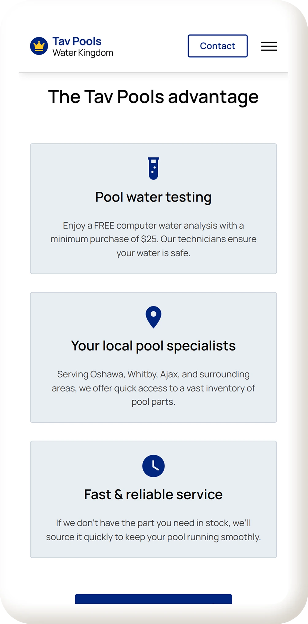
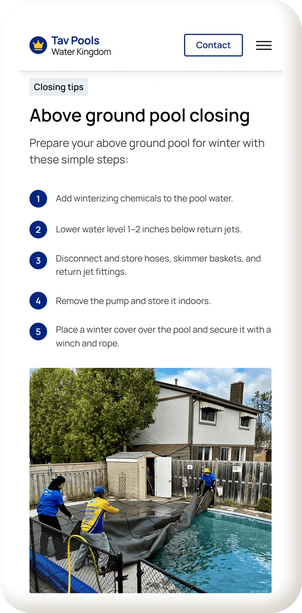
Full Experience
These final screens capture the full redesign, bringing structure, clarity, and visual consistency to the website.
View live site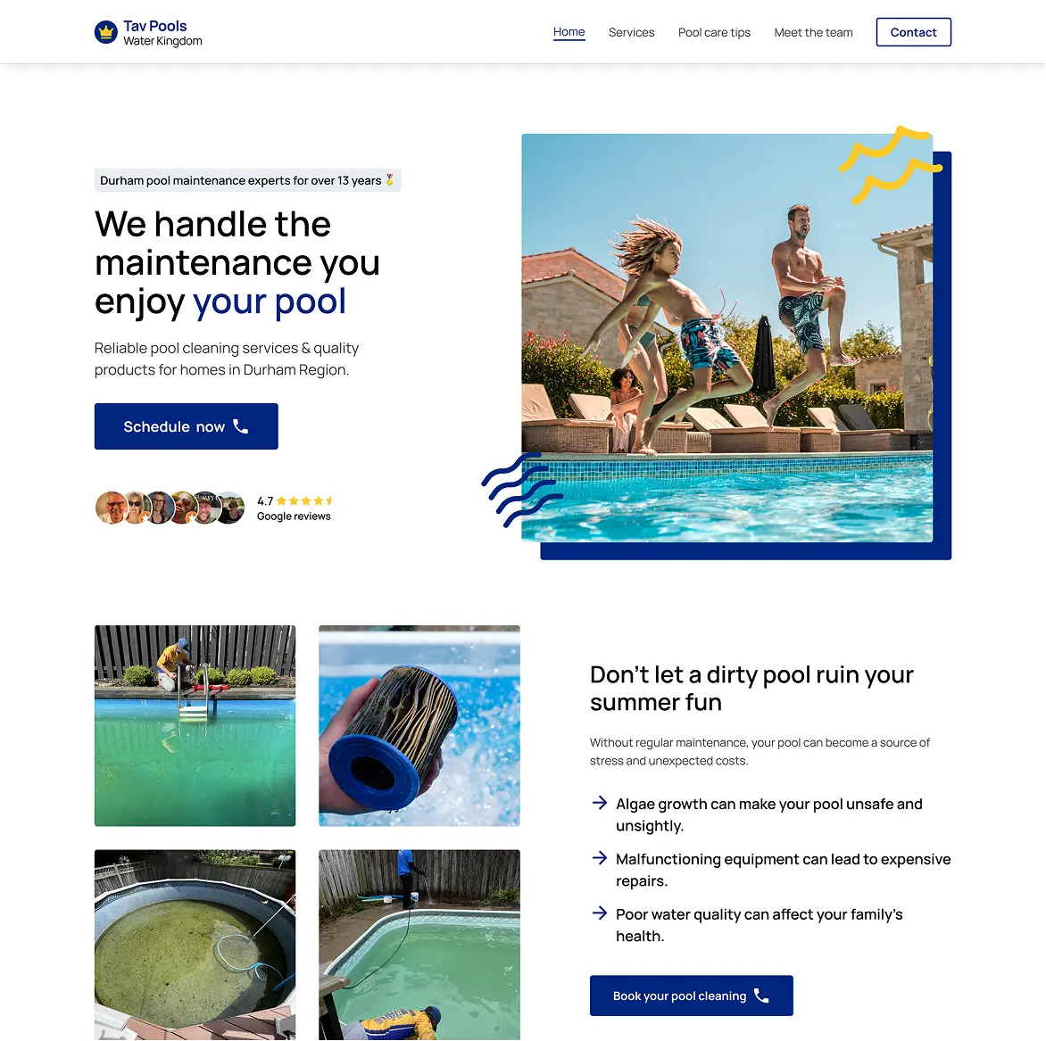
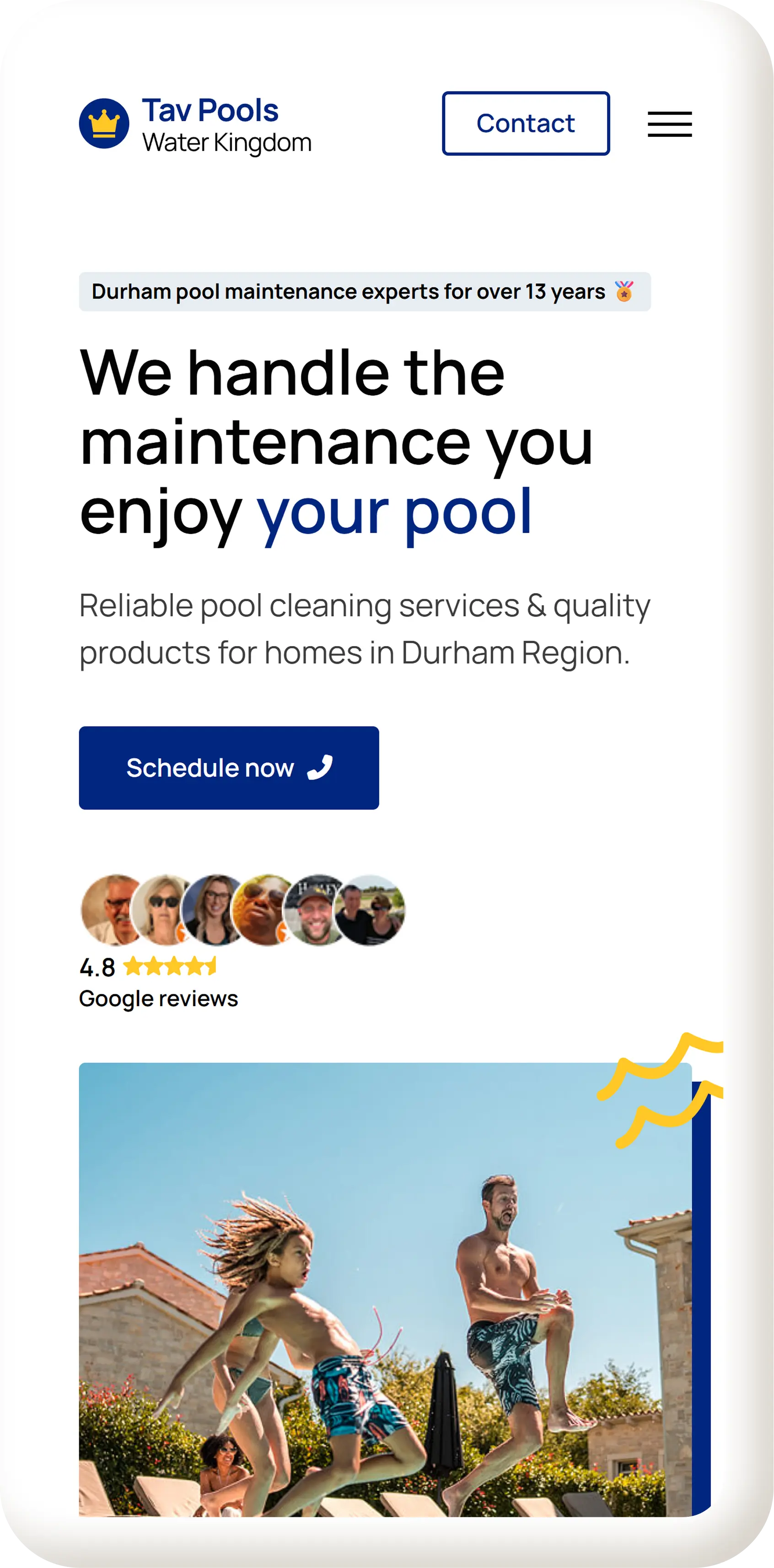
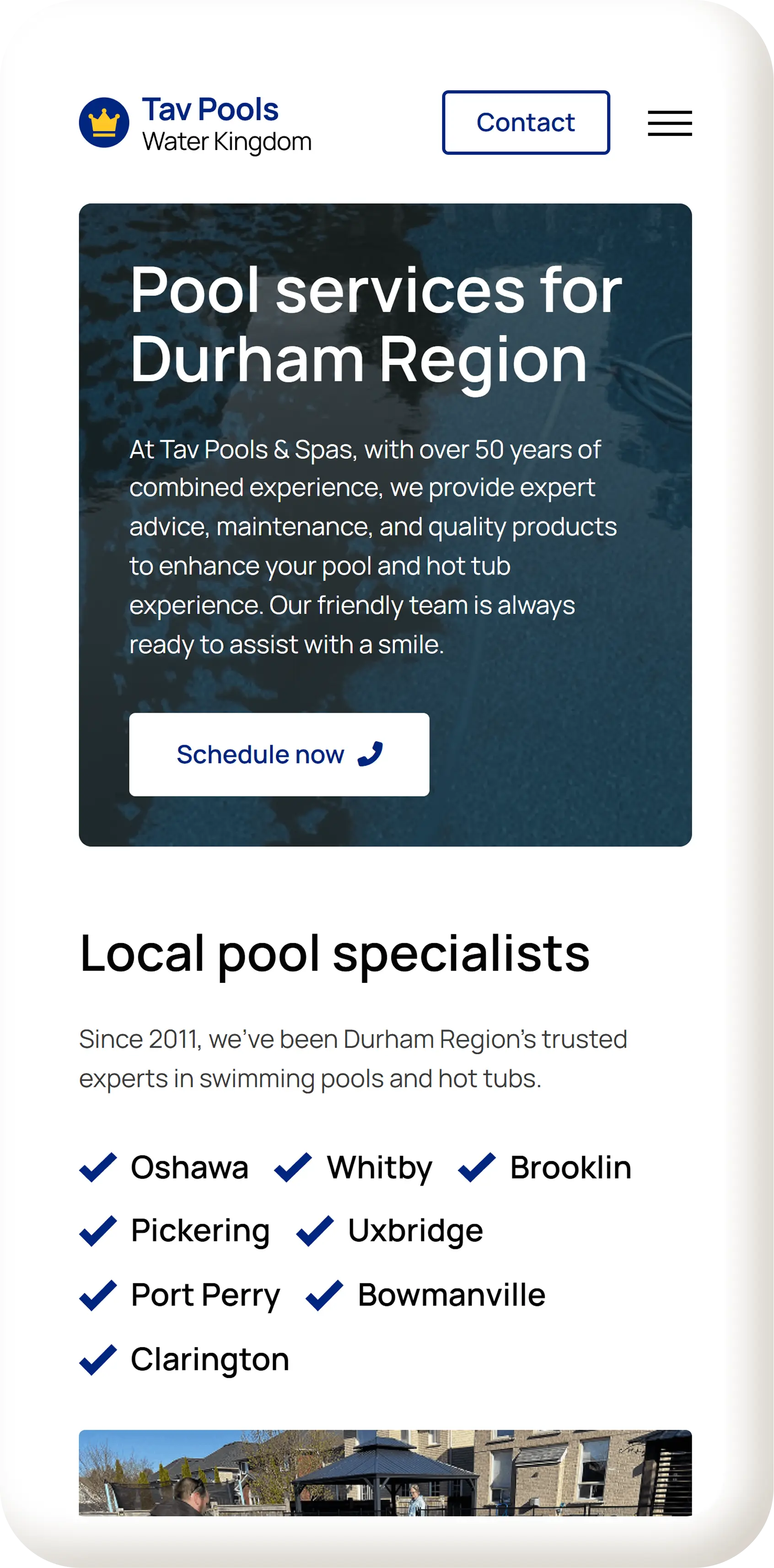
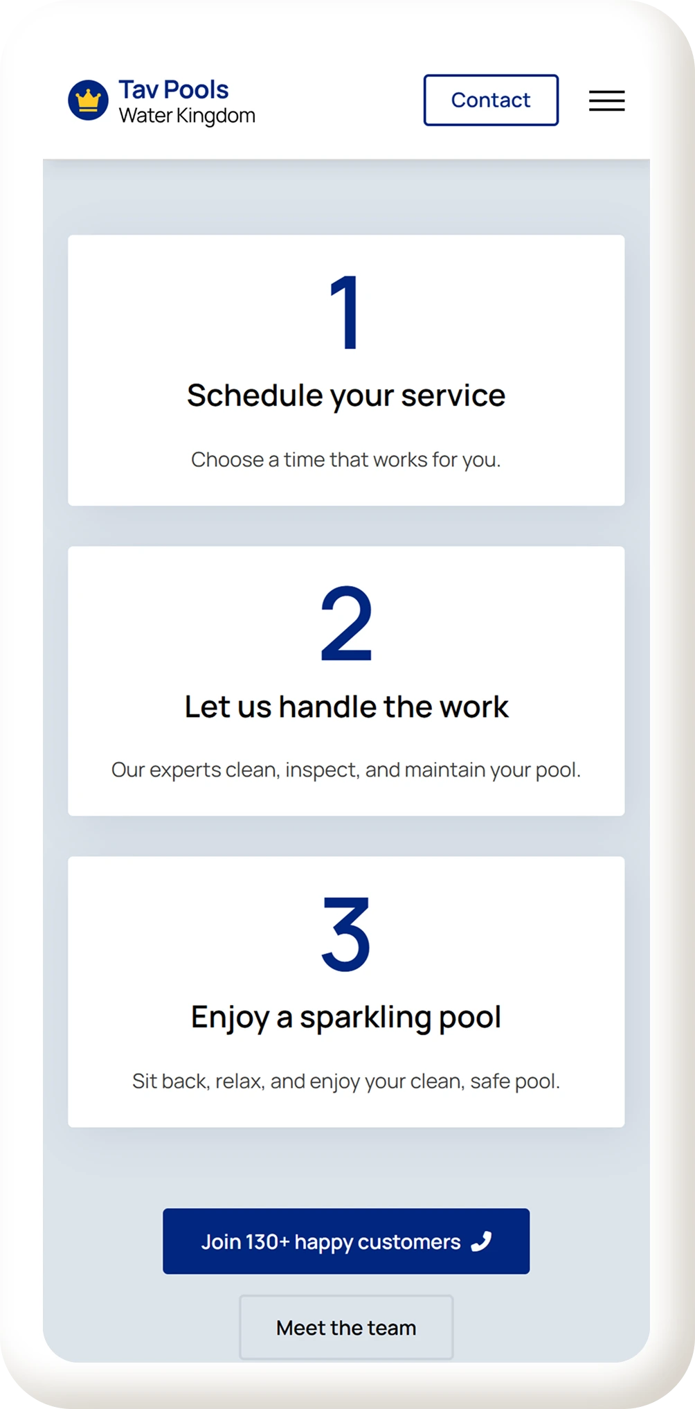
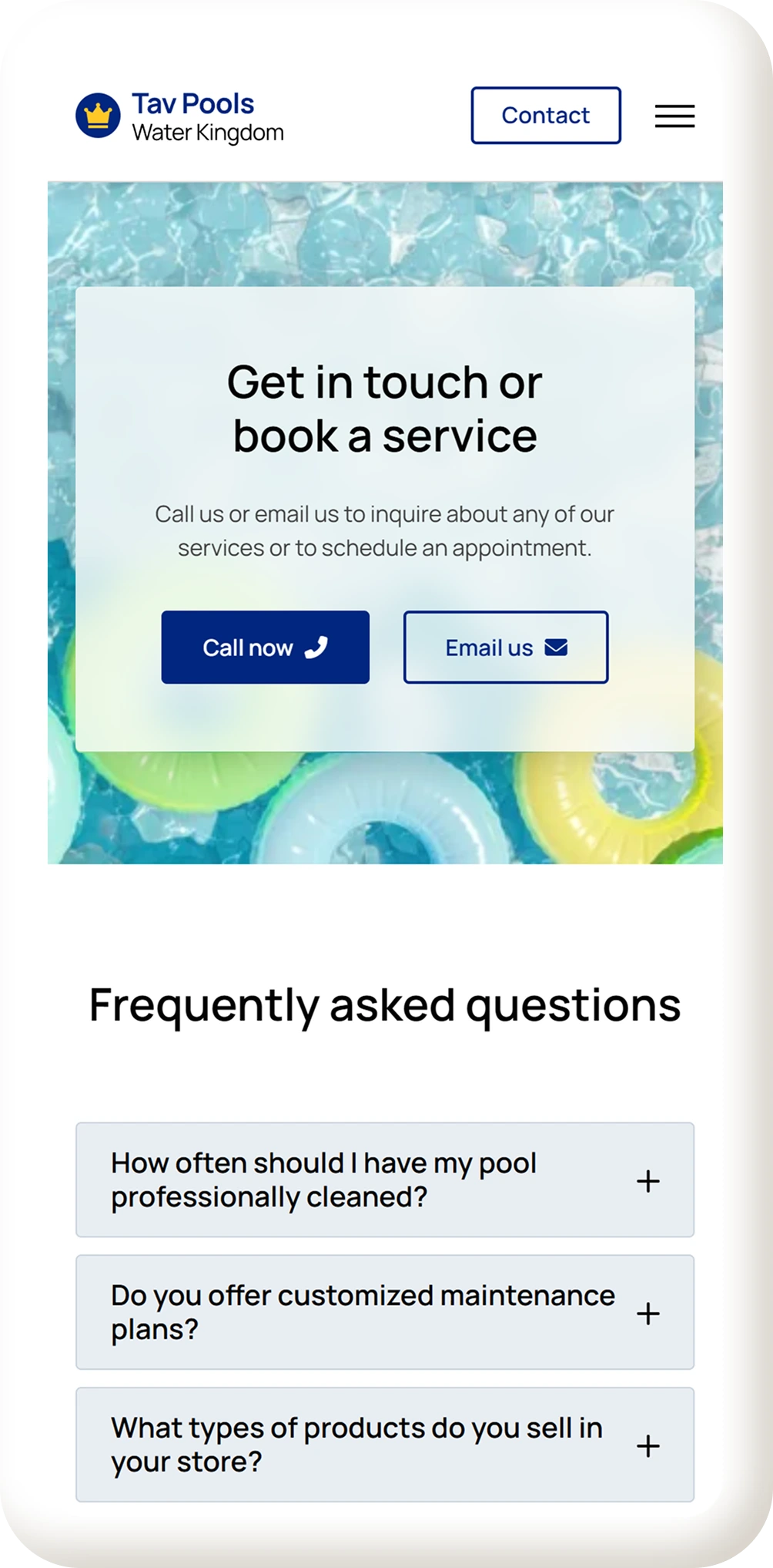
Mobile First
Mobile layouts were refined to maintain strong hierarchy and readability, ensuring users can contact Tav Pools with minimal friction.
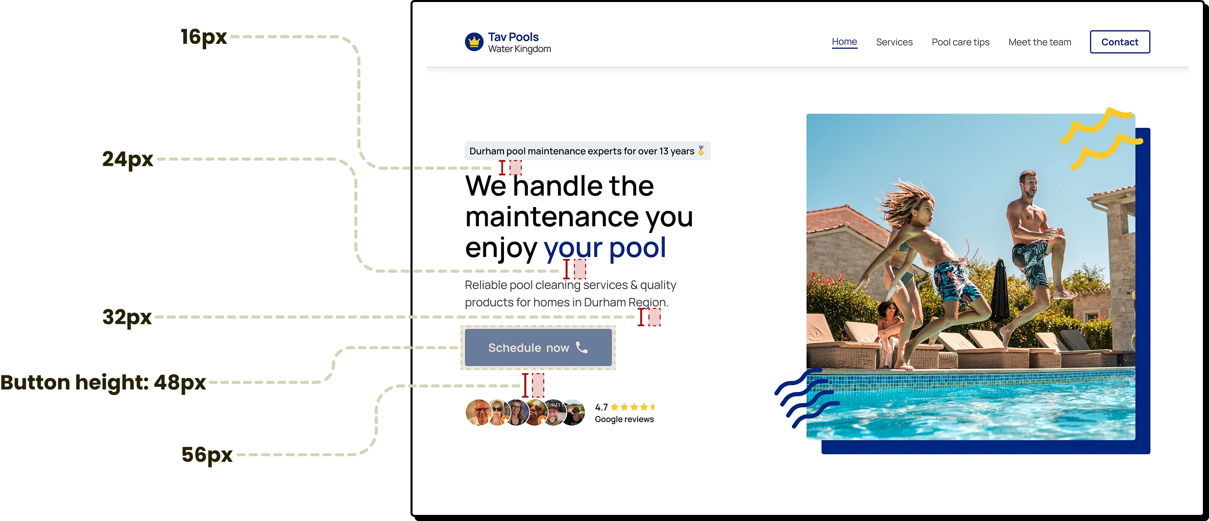
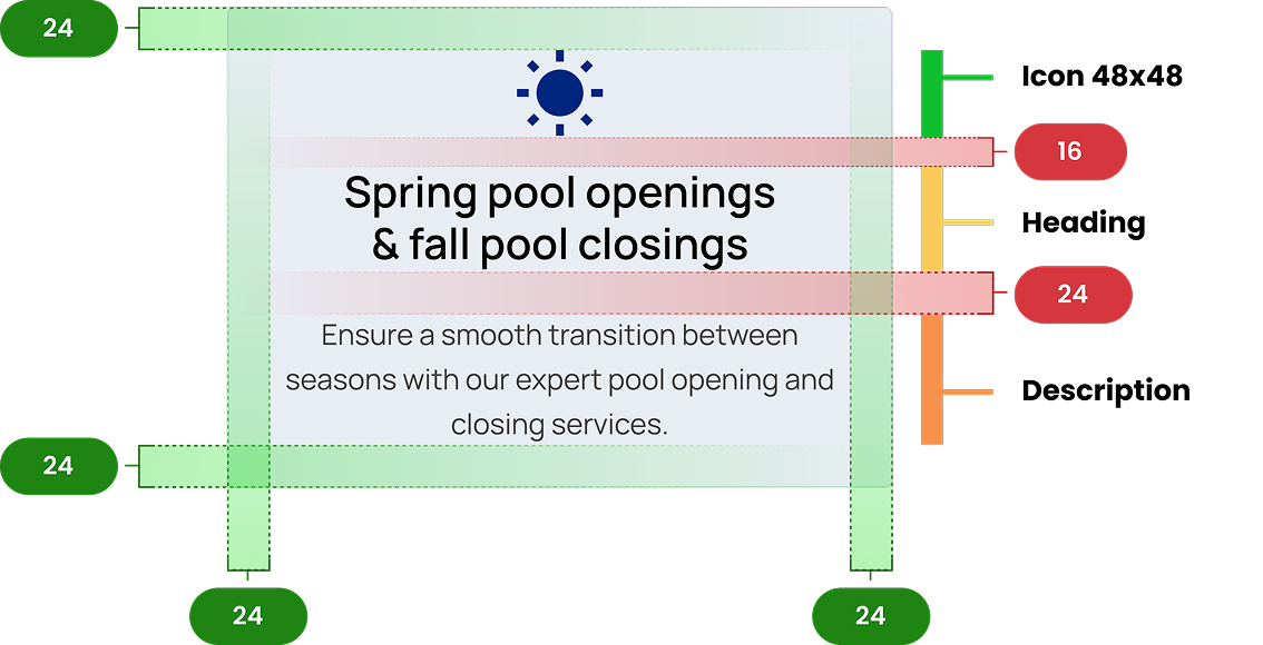
Consistent Spacing
Applying an 8-point grid helped establish predictable spacing and a balanced visual hierarchy throughout the design.
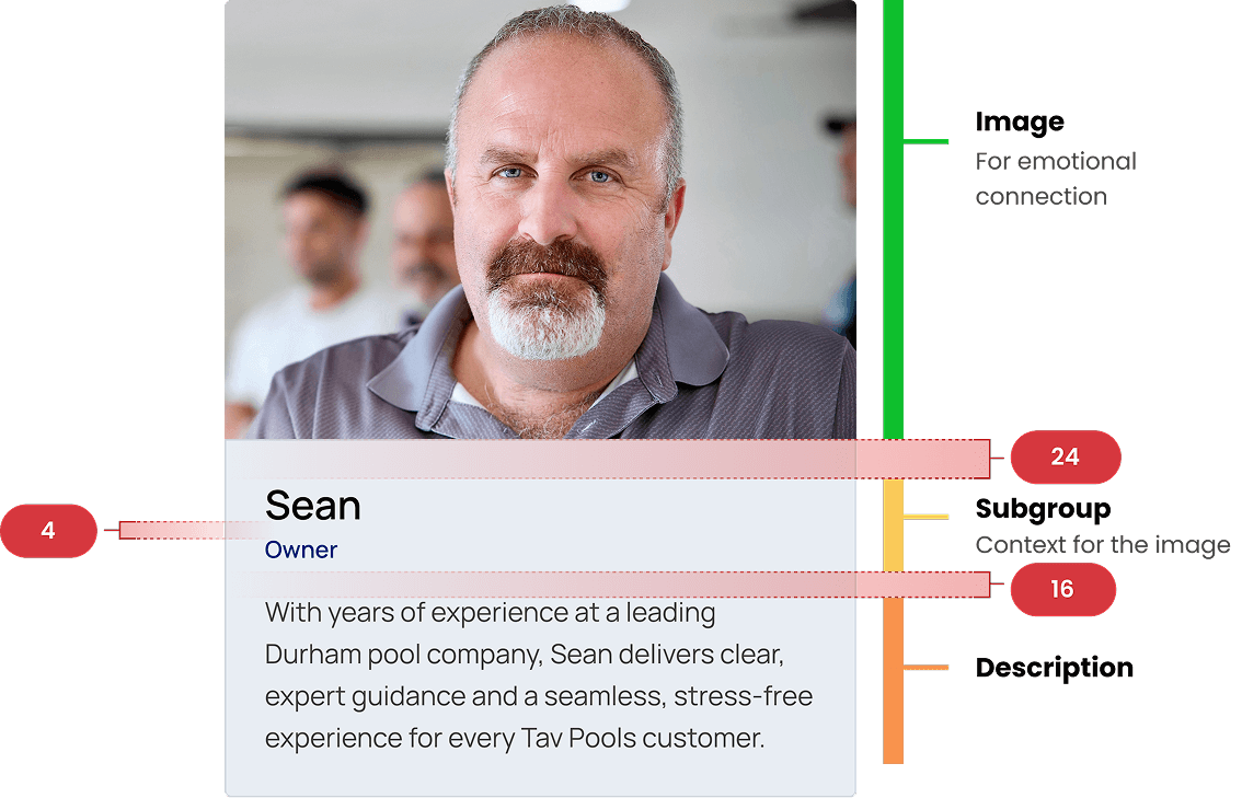
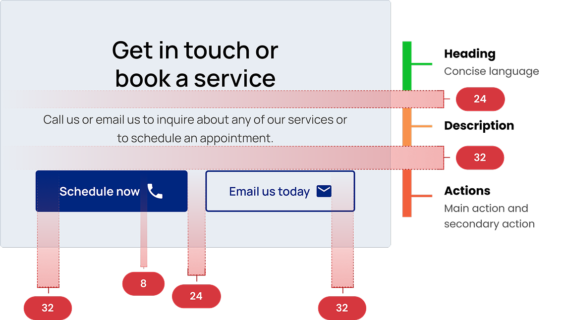
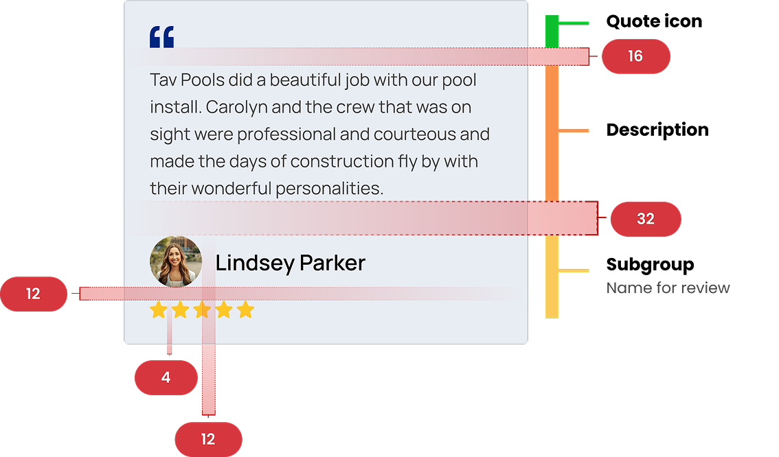
Logical Groups using Hierarchy Strips
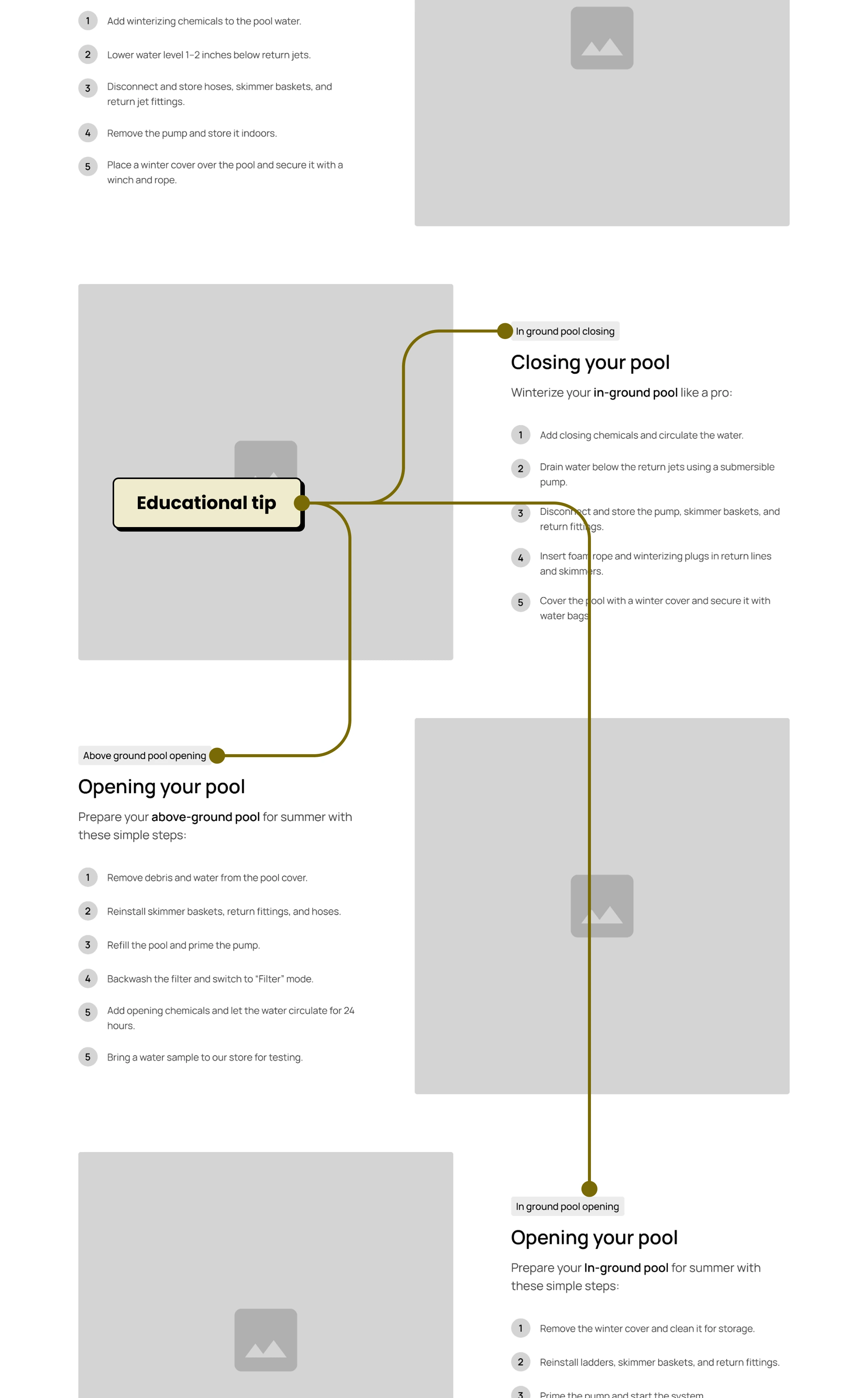
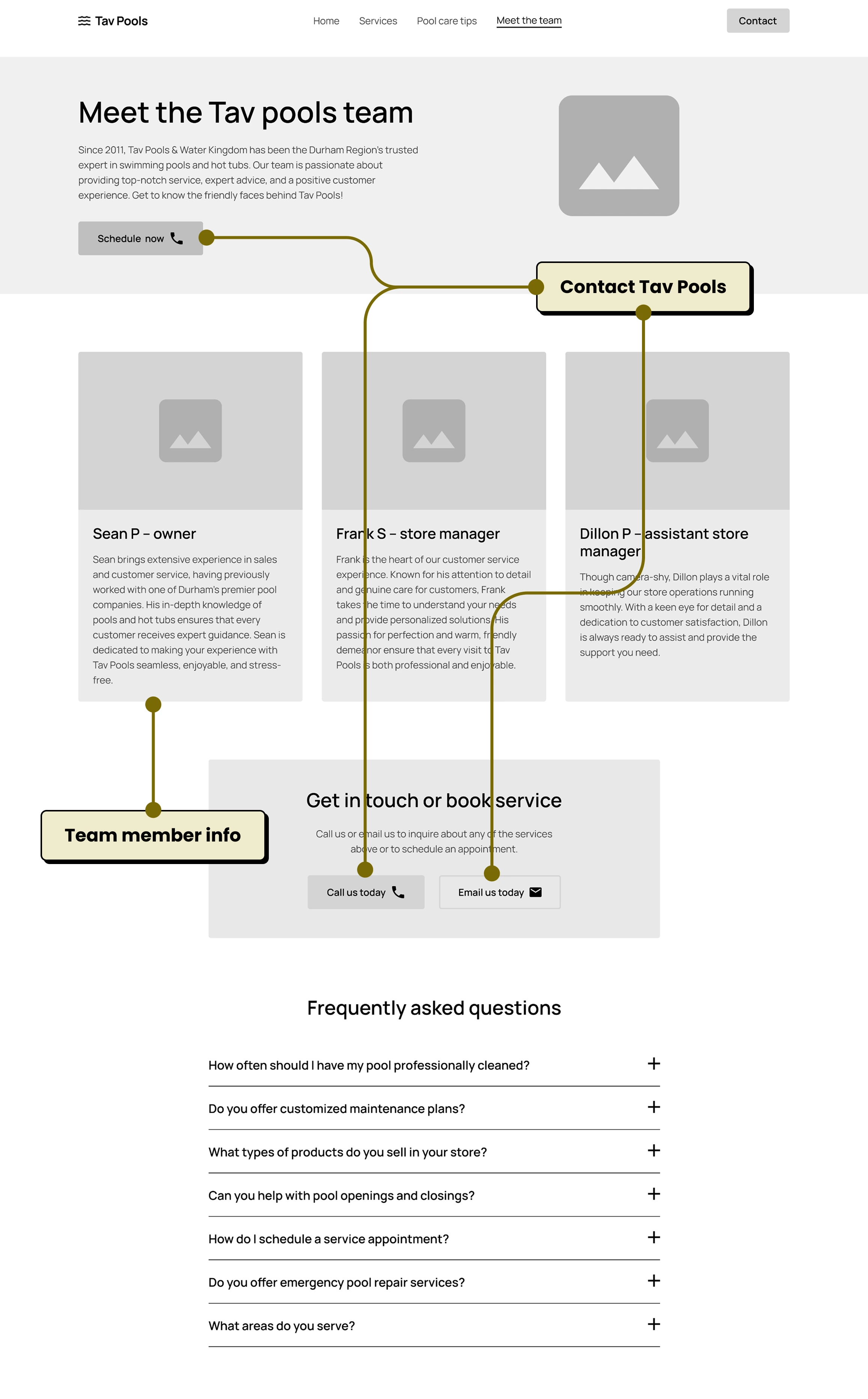
Key components were broken down and annotated to highlight spacing, structure, and the system behind each design element.
Refining Through Feedback
User testing revealed several areas of confusion on the homepage, leading to key refinements that improved clarity and usability.
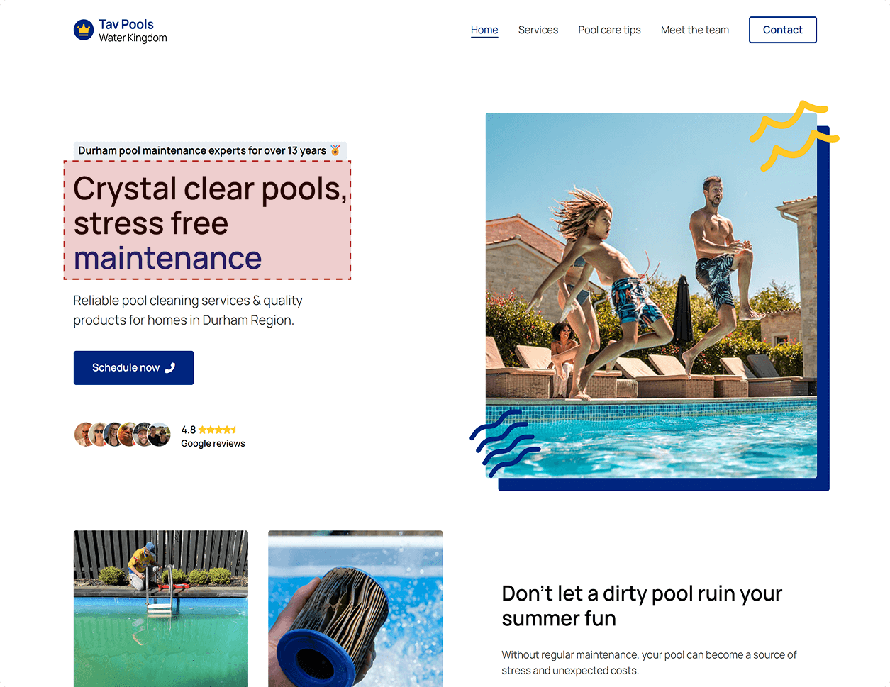
Users found the original H1, “Crystal clear pools, stress-free maintenance,” confusing. Several assumed “Crystal Clear Pools” might be the company's name. This signaled that the heading wasn't communicating the core value clearly enough.
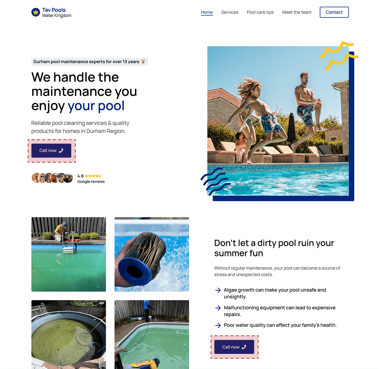
The revised H1 “We handle the maintenance, you enjoy your pool” removes ambiguity and directly states the problem and solution, making the purpose of the site instantly clear.
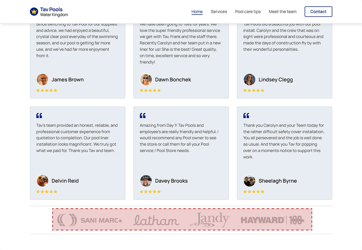
The muted grey logos placed beneath the social proof section left users unsure of what they represented. Were they sponsors? Certifications? Affiliations?
To solve this, a clear label “Proudly partnered with” was added. This simple heading improves context and prevents the logos from appearing random or out of place.
Users noted that the repeated “Call us now” CTA felt overwhelming and repetitive, especially because the homepage features multiple touchpoints designed for conversion.
The fix was to introduce varied, intent-specific CTA language, such as:
From the Client
Honest feedback on the process, partnership, and outcomes delivered through our work together.

Working with Jacob was a game-changer for our business. Our old site felt outdated, and he gave us a fresh, modern redesign that looks great and actually brings in more inquiries. He was easy to communicate with, super organized, and handled everything from the design to the build. We're thrilled with the final result and would highly recommend him to anyone looking to elevate their online presence.

Sean Procunier
Owner - Tav Pools and Water Kingdom