Is The 8 Point Grid System Any Good?

Unlocking Design Excellence: Embracing The 8-Point Grid System In Your UI/UX Endeavors
Whether you're diving into the realm of UI/UX design for the first time or you're a seasoned veteran in the field, chances are you've encountered the term '8-point grid system.' And the question lingers: Is this system worth adopting? If you're only just discovering it after years in the industry, you might even experience a fleeting bout of imposter syndrome.
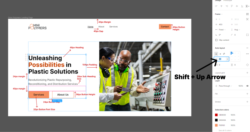
So, what exactly is the 8-point grid system? In essence, it revolves around the meticulous use of multiples of 8 and 4 for spacing, typography sizes, margins, paddings, border-radius, button heights, and more. It acts as a guiding beacon, alleviating the guesswork associated with determining the optimal white space in your designs. By adhering to this system, your designs exude a sense of professionalism and standardization, lending them a refined polish. However, maintaining consistency across your design is paramount. If you opt for 24px spacing between content stacks, such as H2 and body copy, ensure this uniformity persists throughout your design.

Benefits Of The 8-Point Grid System
I personally embraced the 8-point grid system roughly seven months ago. Initially, as I delved into UI design fundamentals, I didn't adhere to any standardized spacing structure. Instead, I focused on honing my design acumen and grasping the essentials: whitespace, color/contrast, typography, visual hierarchy, proximity, alignment, and more.
While incorporating the 8-point grid system into your design workflow isn't obligatory, it's undeniably beneficial. But let's be clear: not adhering to it doesn't diminish your prowess as a designer. What truly matters is a solid foundation in design fundamentals, unwavering consistency in decision-making, and a keen eye for design. In essence, you could craft stellar designs using Microsoft Paint—you aren't bound to Figma.
Sure, you could set your button border radius at 3px, but why not opt for 4px or 8px? Similarly, rather than settling for arbitrary values like 19px for margins between H3 and body copy, consider rounded figures like 20px, 16px, or 24px. While it's undoubtedly convenient to embrace the 8-point grid system, particularly within Figma with its nudge capabilities, the flexibility to experiment shouldn't be overlooked.


Flexibility And Creativity
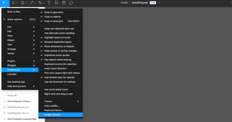
Speaking of Figma, here's a nifty trick: utilizing the nudge command streamlines adherence to the 8-point grid system. By holding down 'Shift + Up arrow key,' you can enact 'big nudges,' adjusting typography sizes and other elements in increments of 10 (or any value you desire, such as 8). This feature proves invaluable, particularly when working with Autolayout, where precise control over spacing is crucial.
Conclusion
In conclusion, while the 8-point grid system isn't compulsory, I wholeheartedly recommend embracing it. Not only does it simplify your workflow—especially when coupled with big nudges and Autolayout—it also enhances your understanding of design fundamentals. Mastering these basics lays a robust groundwork, paving the way for seamless integration of advanced techniques like the 8-point grid system.