Simplifying UX — currently @Hydro One
Design decisions that convert, not just pretty pixels
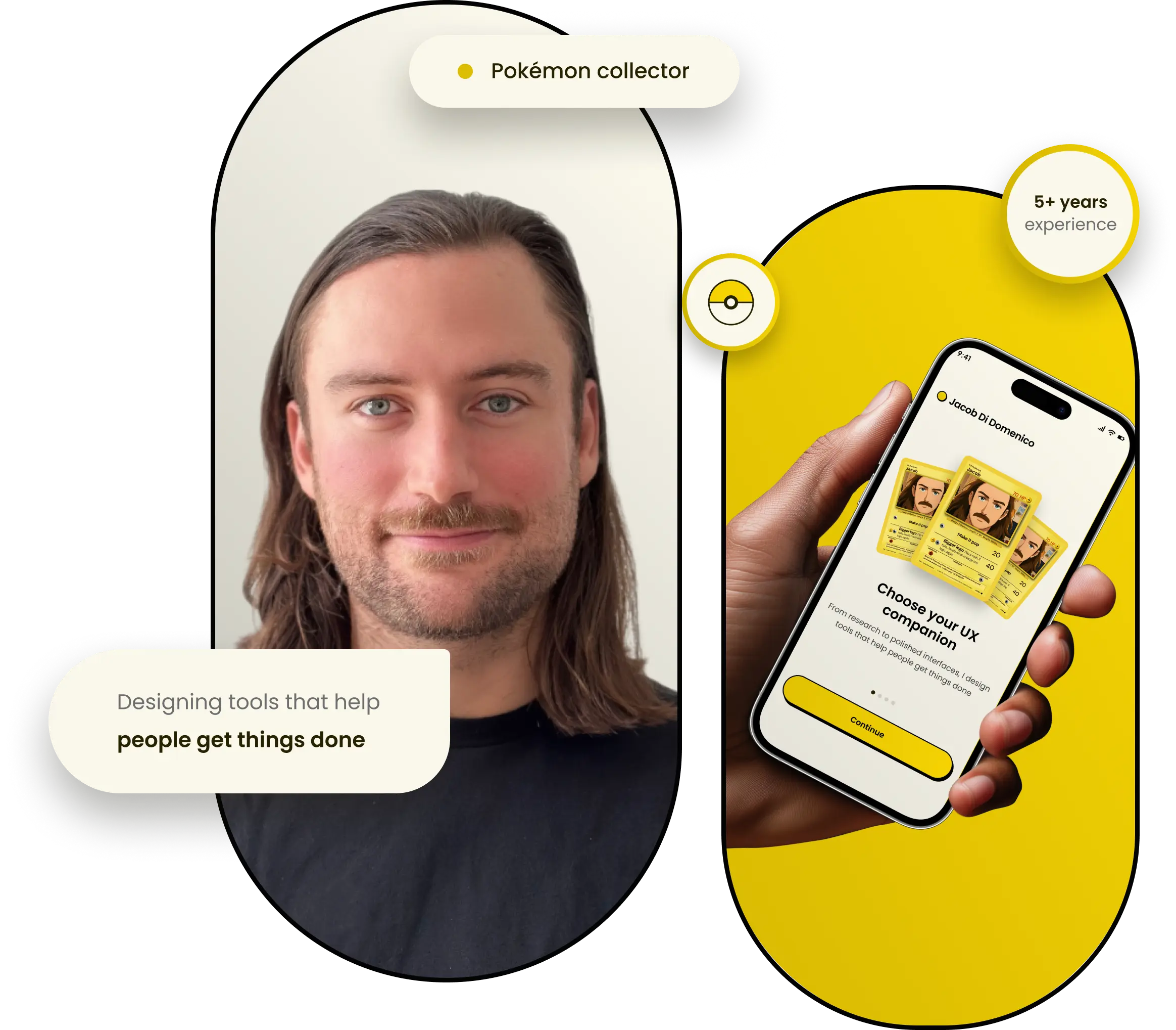
Jacob Di Domenico
Simplifying UX — currently @Hydro One
About me
Hi, I'm Jacob a UX/UI designer based in Toronto, Ontario. I'm just as passionate about crafting high impact, conversion focused interfaces as I am about collecting vintage Pokémon cards. My journey from working in construction to designing for Ontario's largest electricity provider has taught me the value of resilience, a passion for personal growth, and the joy of helping others learn.

My projects
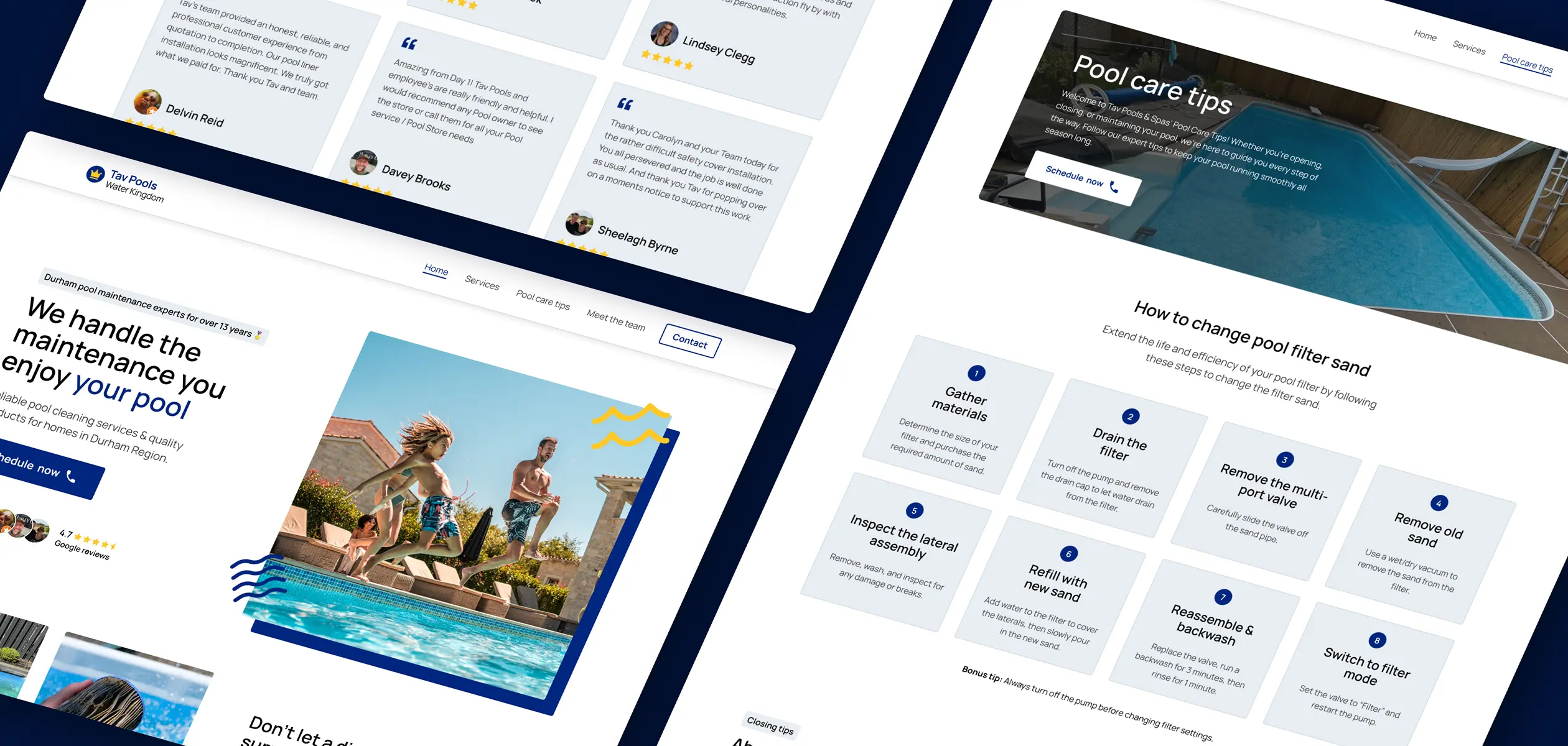
View case study

View case study
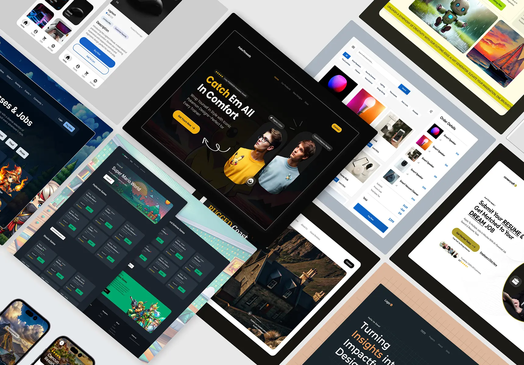
Browse the gallery

Coming soon
Feedback from real collaborators
Jacob was my instructor in a UX/UI bootcamp and a key part of my growth. His knowledge, passion, and support made him an exceptional mentor. I’m incredibly grateful for his guidance and would recommend him to anyone.

Maggie Copland
Digital experience @Walmart
I first met Jacob at the UX Laurier hackathon, where his mentorship helped our team win first place. Since then, he's continued to support my UX journey with valuable guidance. His professionalism and positive energy have been truly inspiring.

Conor McGarry
UXR @Samsung
Jacob was incredible to work with from start to finish. He delivered beyond expectations, kept communication clear despite the time difference, and kept us involved at every step. We can’t wait to work with him again.

Christopher Hampton
General Manager
My tools
HTML
CSS
Bootstrap
Adobe XD
Miro
Figma
jQuery
JavaScript
Bricks
Webflow
Wordpress
Sketch
My design offerings
Wireframes
Hi fidelity
UX research
Competitive analysis
Prototypes
Heuristic annotation
Web development
SEO set up
Webflow
Wordpress
DNS
Bricks Builder
Migration
UI/UX design education
Mentorship
Figma training
Design tutorials
Portfolio reviews
Design leadership